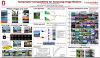
Using Color Compatibility for Assessing Image Realism
|
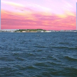
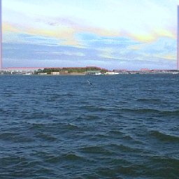
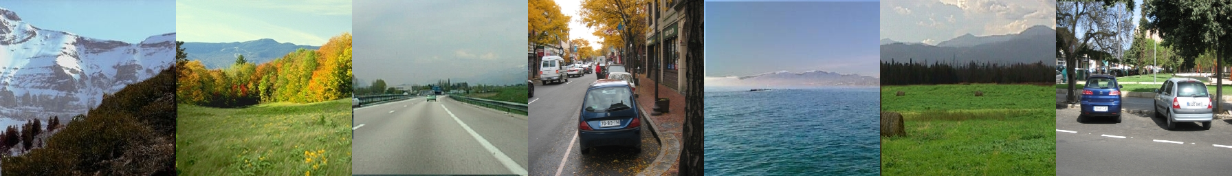
| There are only 2 real images. Can you identify them? (answer below*) |
People
Abstract
Automatic image recoloring
Why does placing an object from one photograph into another often make the colors of that object suddenly look wrong? One possibility is that humans prefer distributions of colors that are often found in nature; that is, we find pleasing these color combinations that we see often. Another possibility is that humans simply prefer colors to be consistent within an image, regardless of what they are. In this paper, we explore some of these issues by studying the color statistics of a large dataset of natural images, and by looking at differences in color distribution in realistic and unrealistic images. We apply our findings to two problems: 1) classifying composite images into realistic vs. non-realistic, and 2) recoloring image regions for realistic compositing.
Citation
|
Jean-François Lalonde and Alexei A. Efros. Using Color Compatibility for Assessing Image Realism, IEEE International Conference on Computer Vision, 2007. [PDF] [BibTeX] |
Poster
|
Download the poster that was presented at ICCV 2007 here: [PDF, 11.8MB]. |
Code
Download the code for this paper in a ZIP file, or get it from github.
Dataset
The semi-automatically generated dataset we used to obtain all the results in the paper is available for download HERE. We also provide an example matlab function which loops over all the images in the database, extract various useful information, and displays it to the screen. This is meant to provide a starting point to anyone interested in performing experiments on the dataset.
|
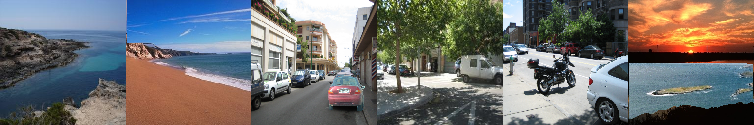
| Examples of realistic composites from our database |

|
| Examples of unrealistic composites from our database |
Funding
This research is supported by:
- NSF CCF-0541230
- NSF CAREER IIS-0546547