source tiger: https://mynicetime23.files.wordpress.com/2014/09/tiger-face-16.jpg
The results here looks good:
The approach is as follows:
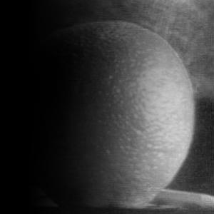
1. take low frequencies of image
2. subtract low frequencies from original image
3. superimpose image edges on original image
This step was done using a Gaussian filter.
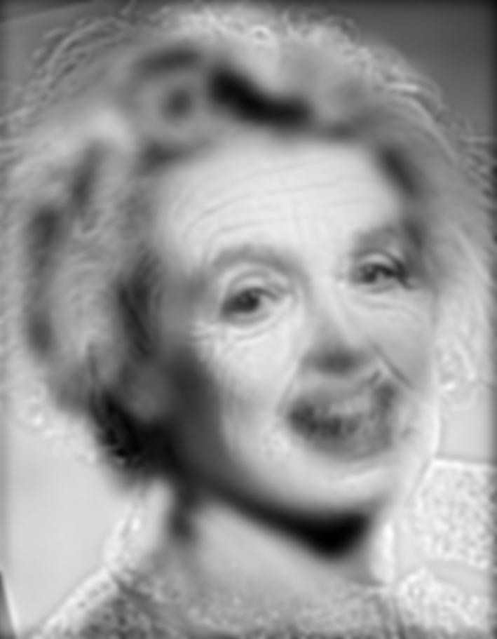
The first crucial aspect is the selection of an appropriate Gaussian filter. I chose
a sigma of 7. Thus, as the half of the filter size should be 3*sigma, a 42x42 Gaussian
kernel was chosen.
The second parameter to define is alpha, which controls the superposition of form:
img_sharpened = (1-alpha) * original + alpha * edges. Here, I set alpha to 0.2.
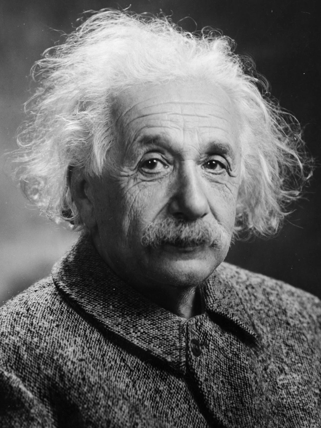
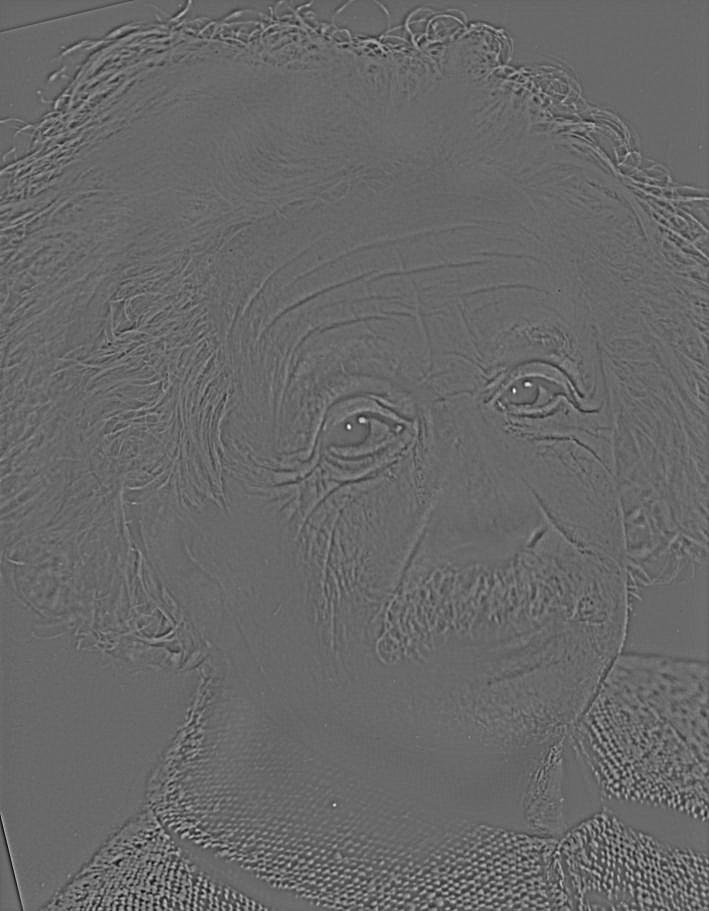
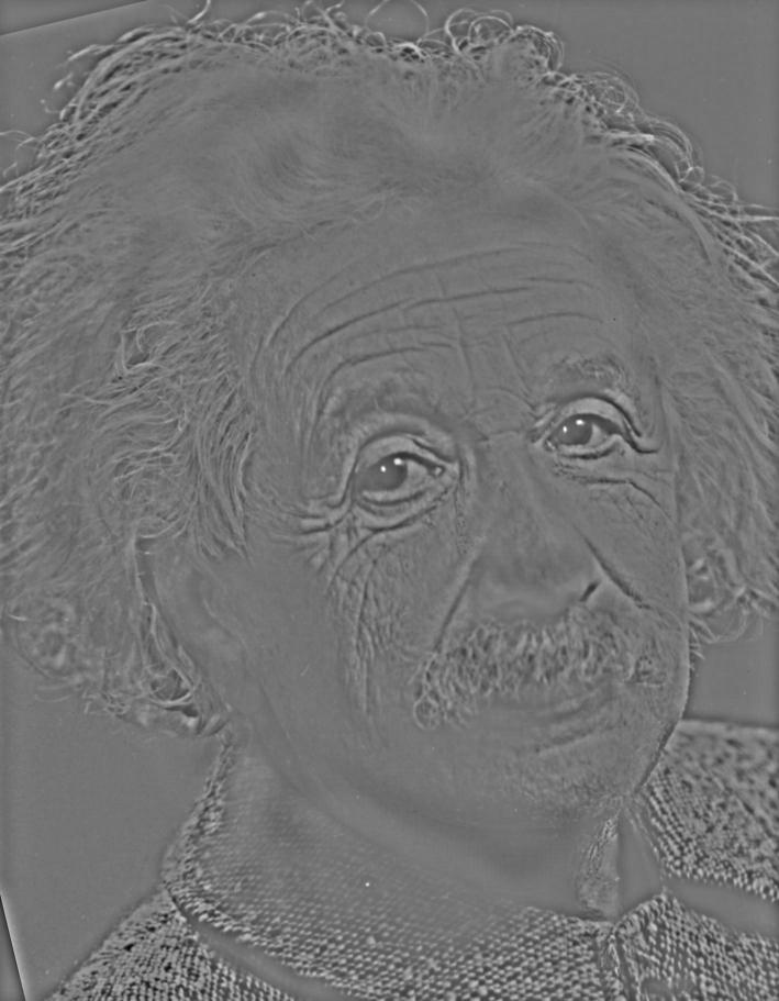
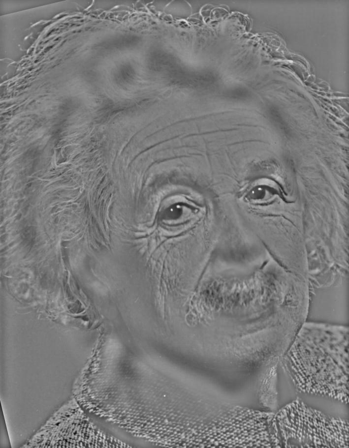
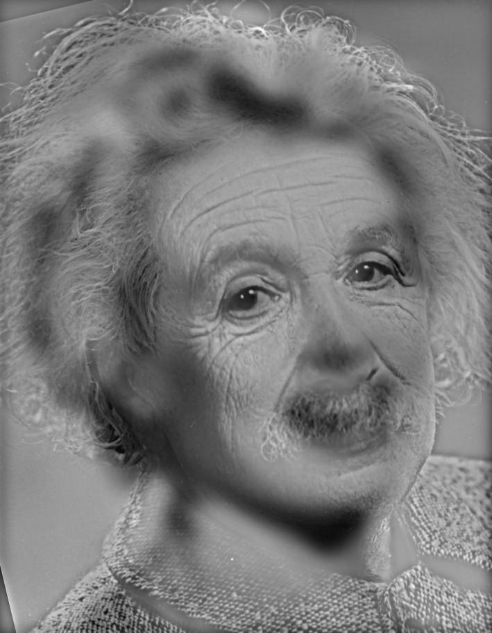
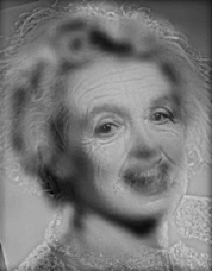
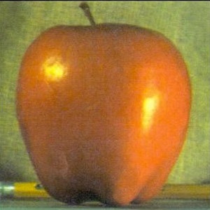
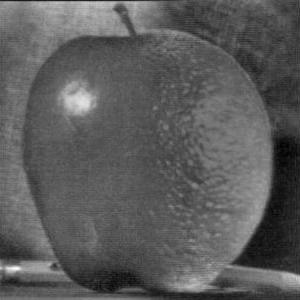
original Einstein:
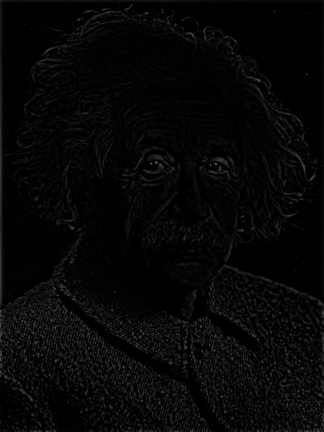
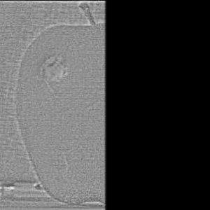
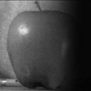
edges
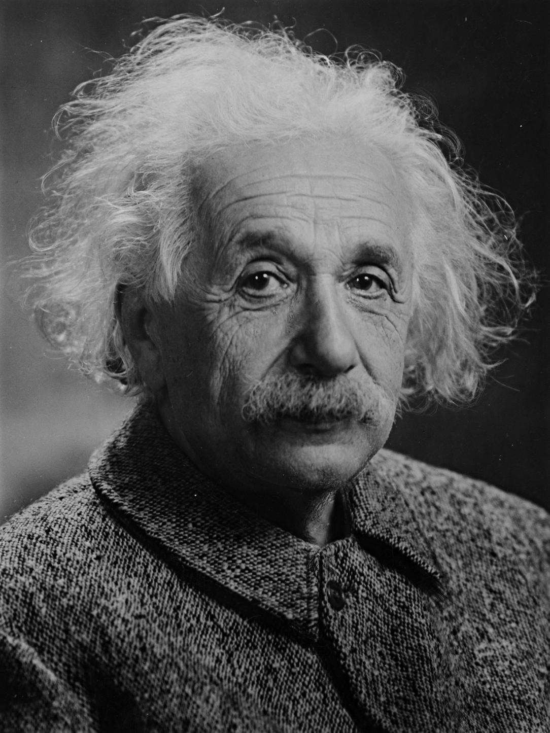
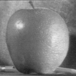
sharpened image
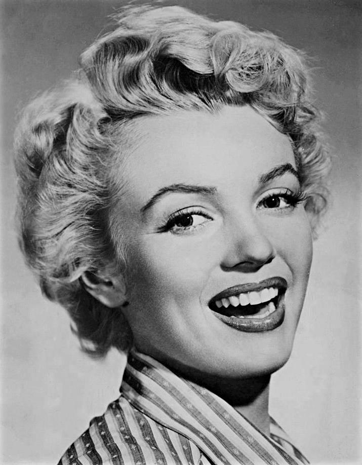
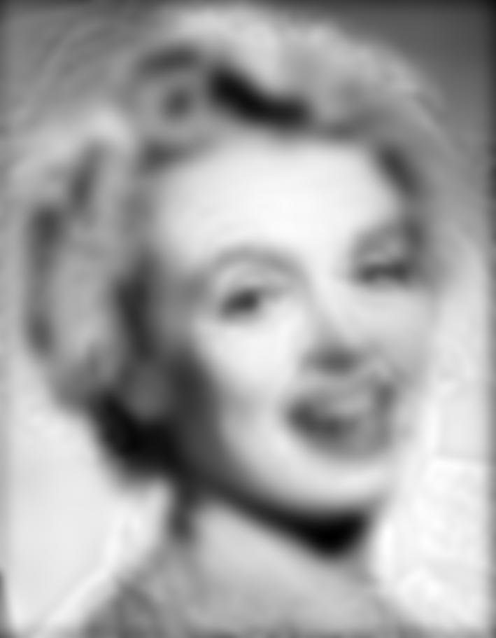
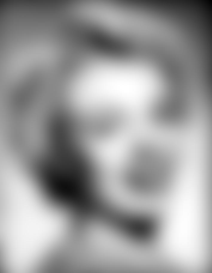
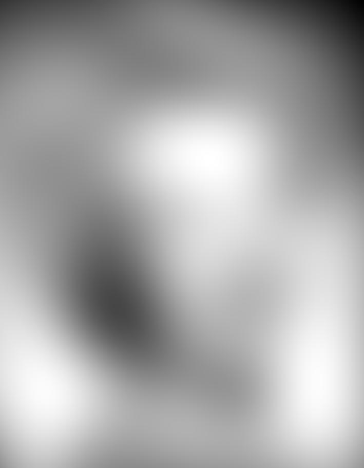
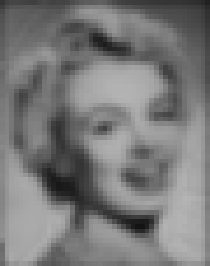
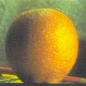
original Monroe
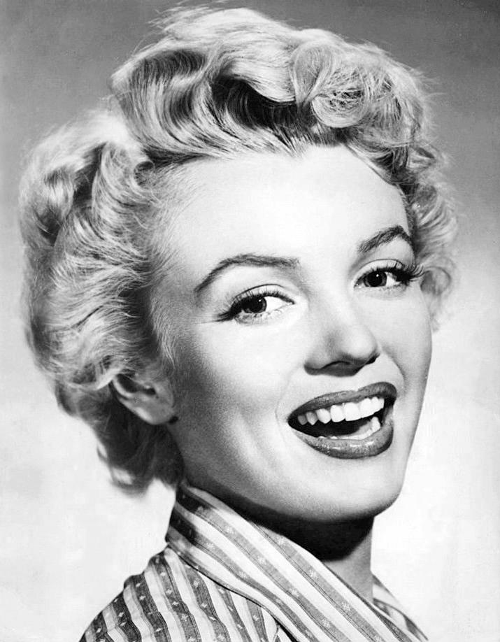
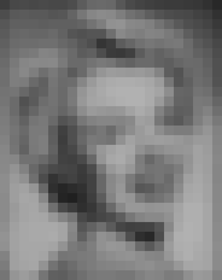
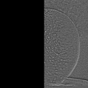
edges
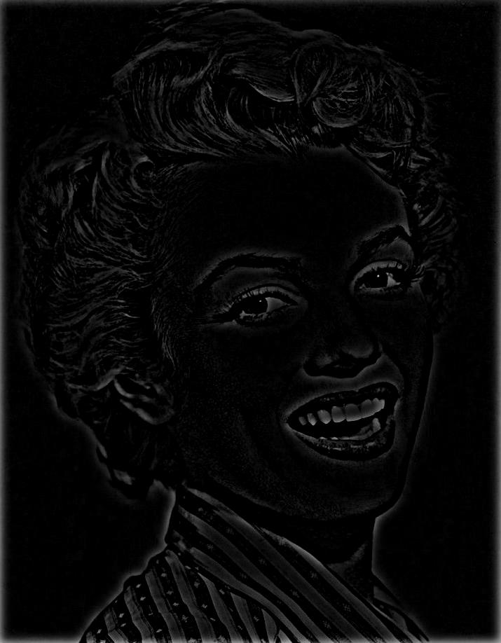
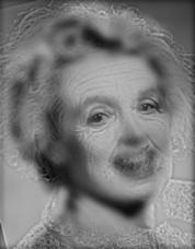
sharpened image
As visible, the edges are well recognized. On the other hand, the sharpening is hard to recognize in the result, as alpha was set rather small. As the edges-image is very dark (only edges are bright), the result is less bright than the original image. Thus, I increased the brightness of the final images as displayed here by 30%.
1. Low-pass filter first image
2a. Low-pass filter second image
2b. Subtract low-frequencies from second image in order to retain high frequencies only
3. superimpose the two images
Gaussian low-pass filters have been applied. Filter size was chosen relative to sigma, where the
side length of the quadratic filters was set to (6*sigma) + 1. This follows the rule of thumb according to which half the
side length of the filter should equal 3*sigma.
For the superposition, I augmented the brightness values of the second image be bringing the
mean I2_high to the same mean as I1_low. This is in contradiction to the approach proposed by
Oliva et al., 2006, but lead to more pleasing results. Thus, superposition was computed as:
I_hybrid = 1 * (I1_low) + (mean(Im1_low) / mean(Im2_high)) * (I2_high),
where: Im2_high = Im2 - Im2_low.
The tricky part is to define the cut-off-frequencies for the low- and highpass-filters. I found the hybrid images to be
largely dominated by high frequencies of image 2, so I retained as much low-frequency portion of this image as possible. Furthermore,
I anticipated that the two frequencies of the images should overlap to some degree. I finally chose the following settings:
cut-off-frequency low-pass (image 1): 12
cut-off frequency high-pass (image 2): 4 (i.e. low pass filter for second image, which later is subtracted from original image 2)
The results look as follows:
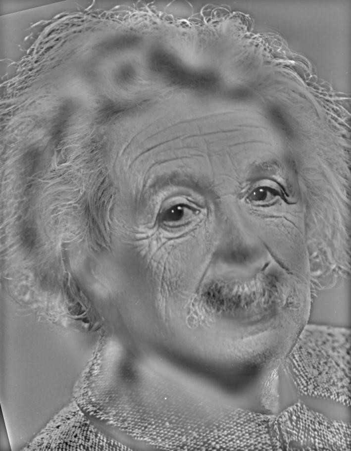
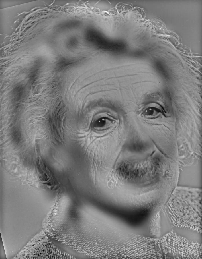
original Einstein:
original Monroe
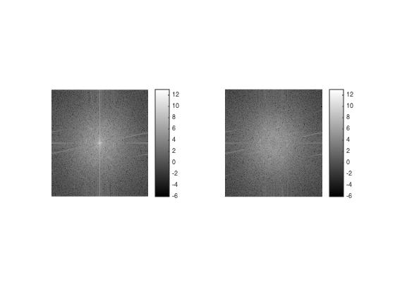
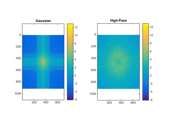
Log spectra of Monroe: original image
Log spectra of Monroe: low-pass filtered image
Log spectra of Einstein: original image
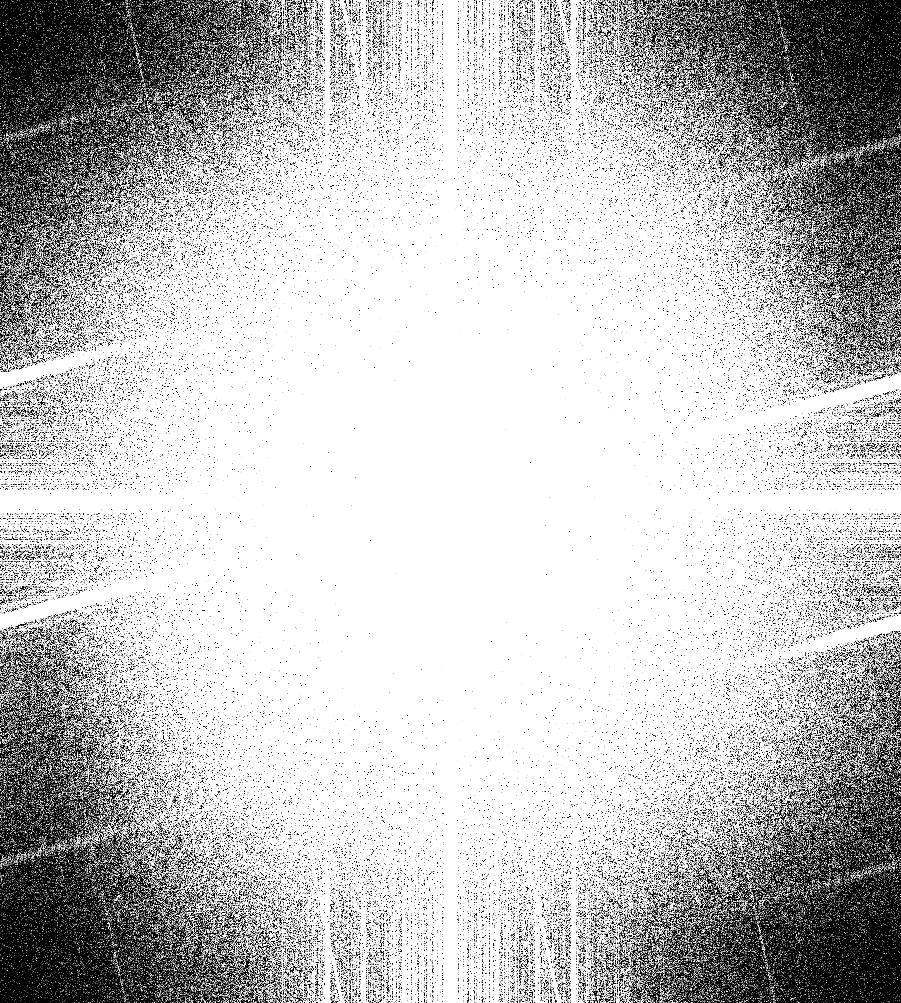
Log spectra of Einstein: high-pass filtered image
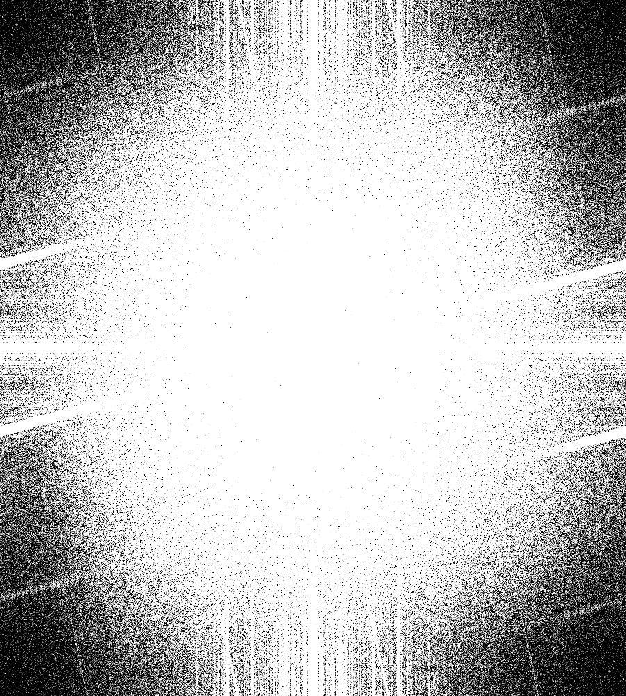
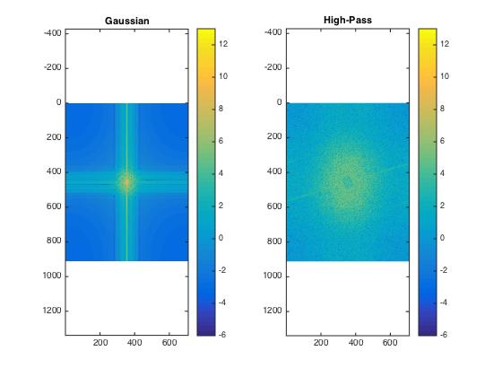
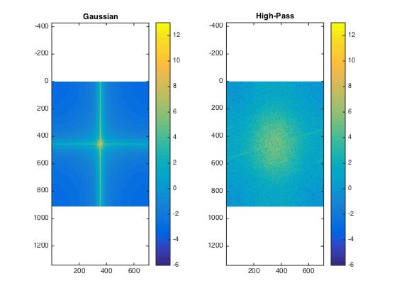
And here a bit more distinct:
Log spectra of Monroe: original (left) and low-pass filtered image (right)
Log spectra of Einstein: original (left) and high-pass filtered image (right)
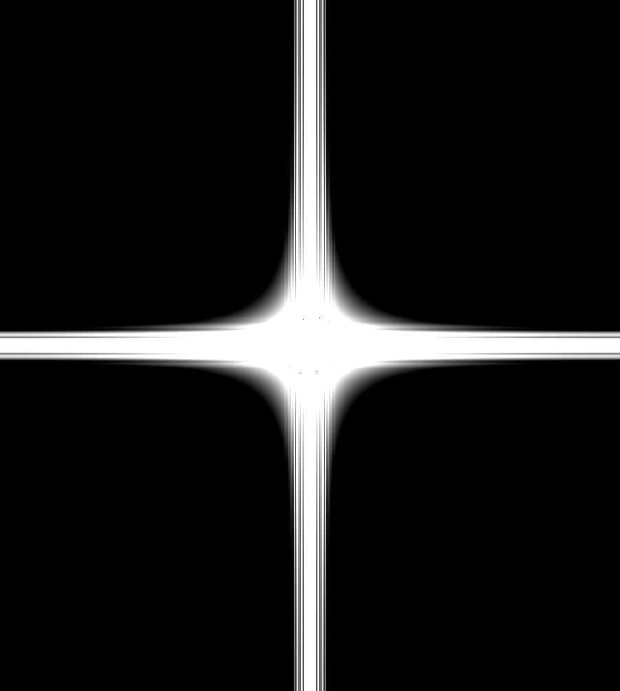
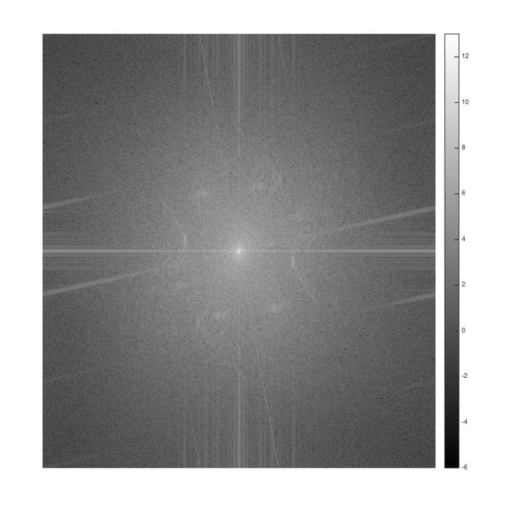
hybrid image, cut to the actual size of the overlap

Log spectrum of hybrid image
Devil, used for the blurred image
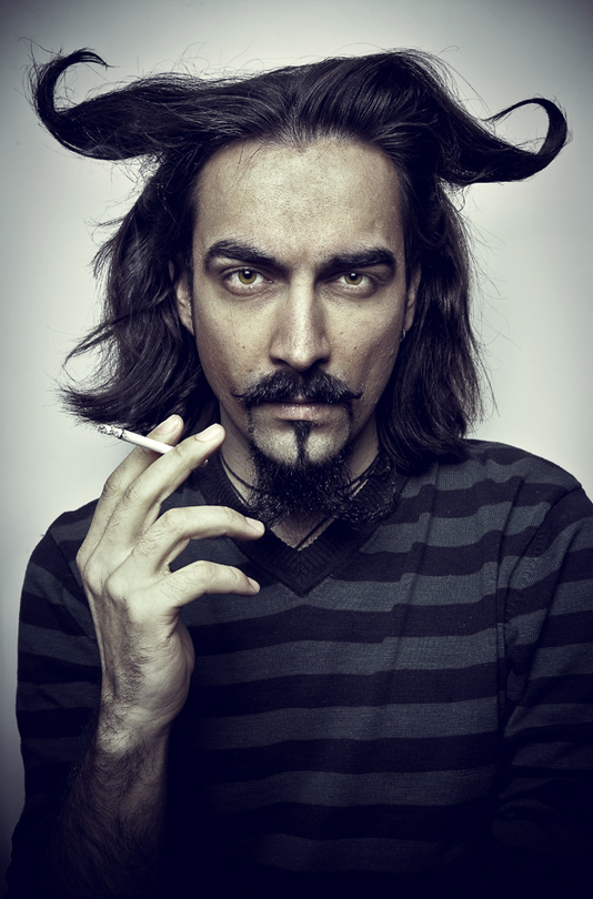 source: http://www.portrait-photos.org/_photo/3181255.jpg
Angel, used for the sharp image
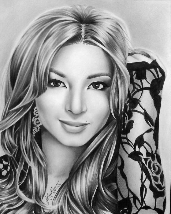 Angel: http://www.stars-portraits.com/img/portraits/stars/a/angel-locsin/angel-locsin-5-by-Madison%5B250440%5D.jpg
Hybrid image
Here, I had to modify the cut-off frequencies to:
low-pass (devil): 3
high-pass (angel): 4
One of the problems was that the angel image is a drawing with distinct edges already, thus, the original image
already is sort of high-pass-filtered. Therefore, cut-off frequencies had to be reduced to lower frequencies.
Snowdon, used for the blurred image

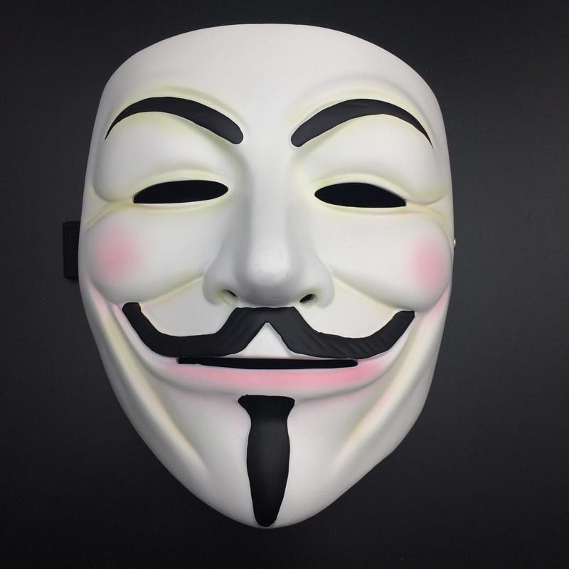
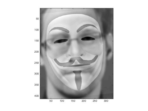
Fawkes mask, used for the sharp image
Hybrid image
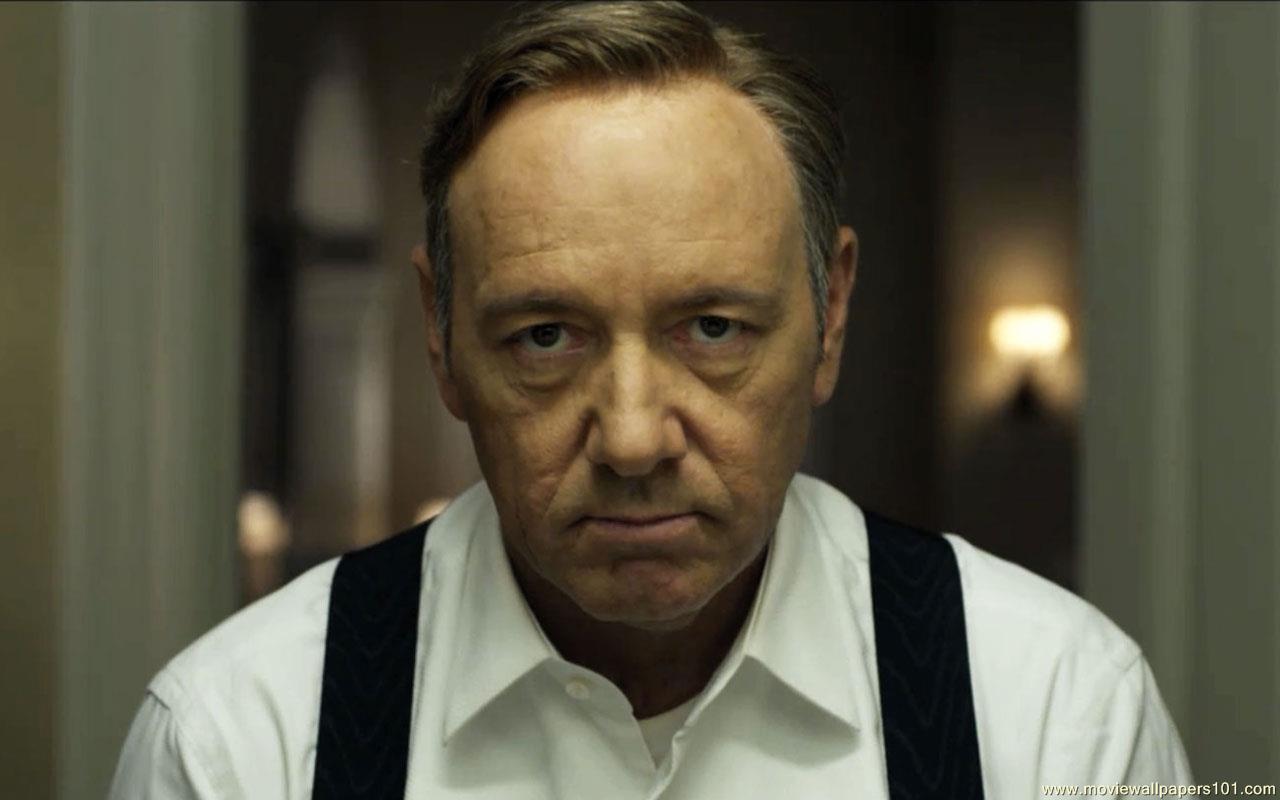
Kevin Spacey (in House of Cards), used for the blurred image
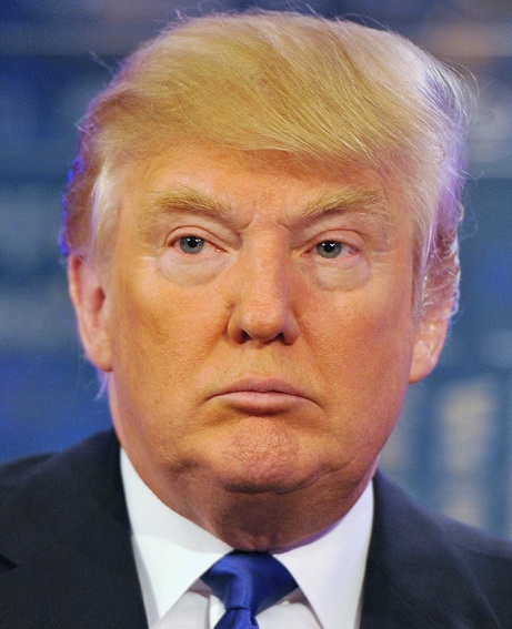
Trump, used for the sharp image
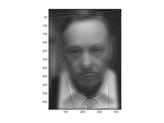
Hybrid image
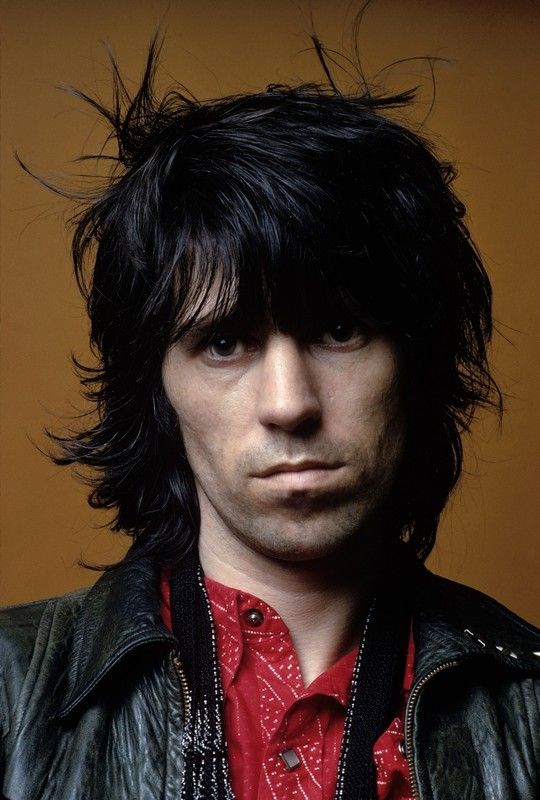
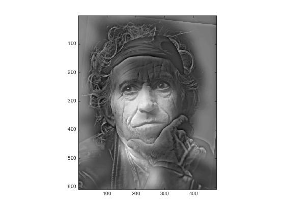
Keith Richards as young man, used for the blurred image
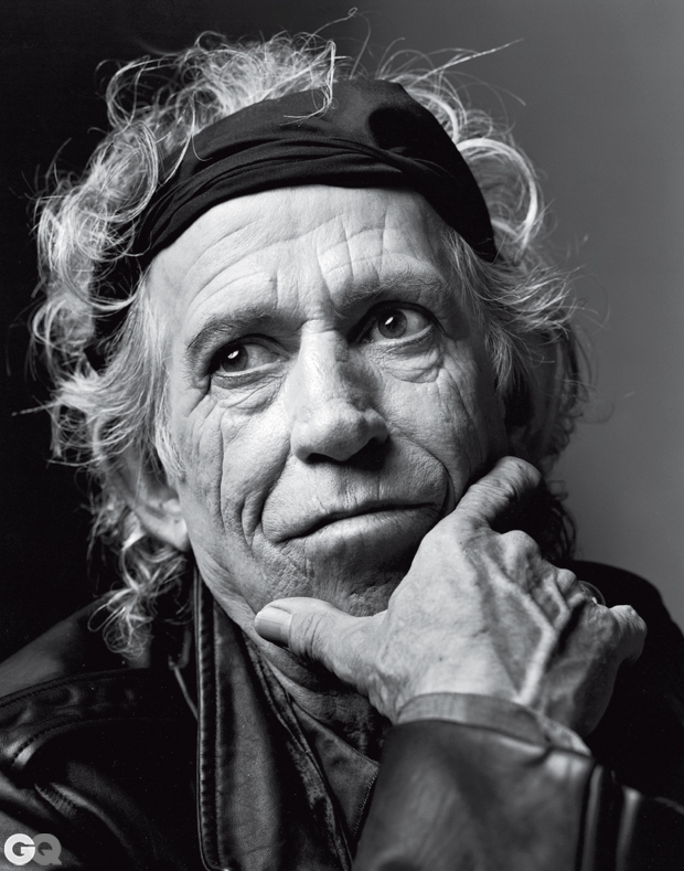
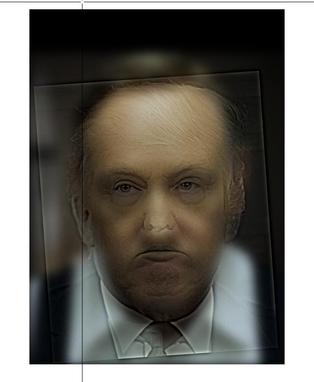
Keith Richards today, used for the sharp image
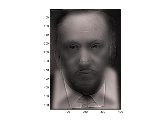
Hybrid image
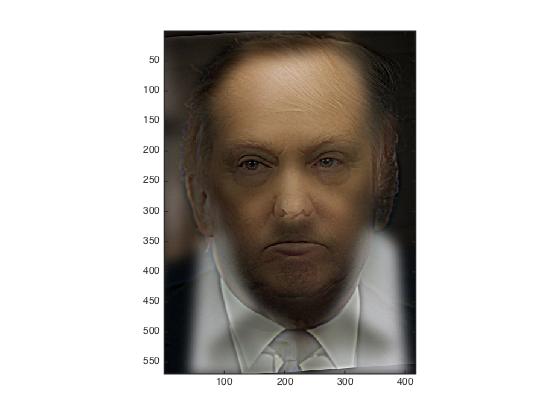
Hybrid image, both images black and white
Hybrid image, images 1 color, image 2 black and white
Hybrid image, images 1 black and white, image 2 color
Hybrid image, images 1 color, image 2 color
Happy face which is used for the blurred image
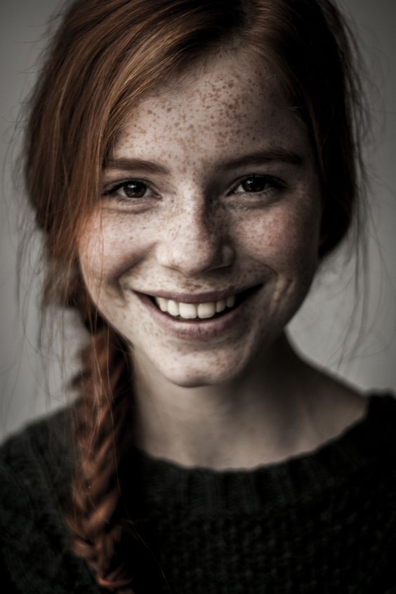
Sad face which is used for the sharp image
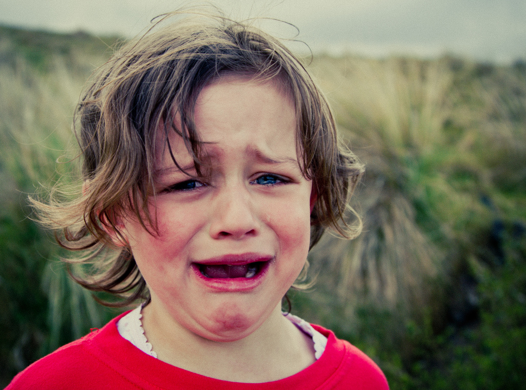
The results looks as follows. Happy face is always blurred (i.e. visible at distance), sad face is sharpened (i.e. visible when close):
Happy face b/w, sad face b/w
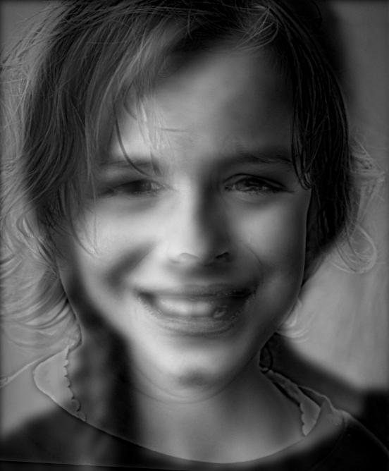
Happy face b/w, sad face color
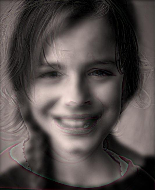
Happy face color, sad face b/w
Happy face color, sad face color
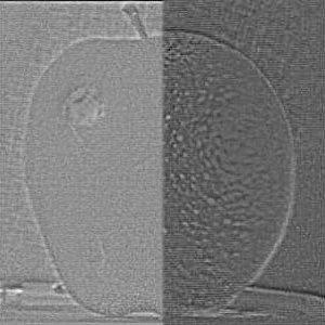
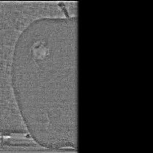
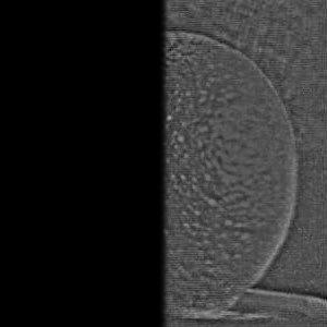
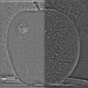
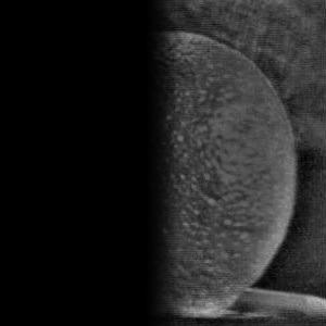
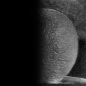
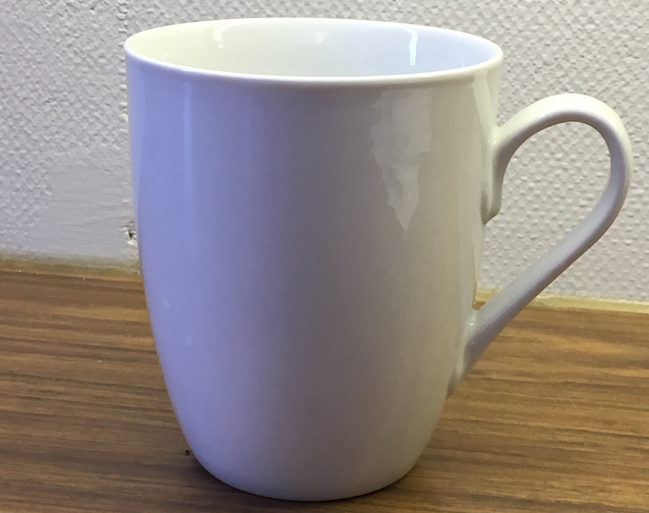
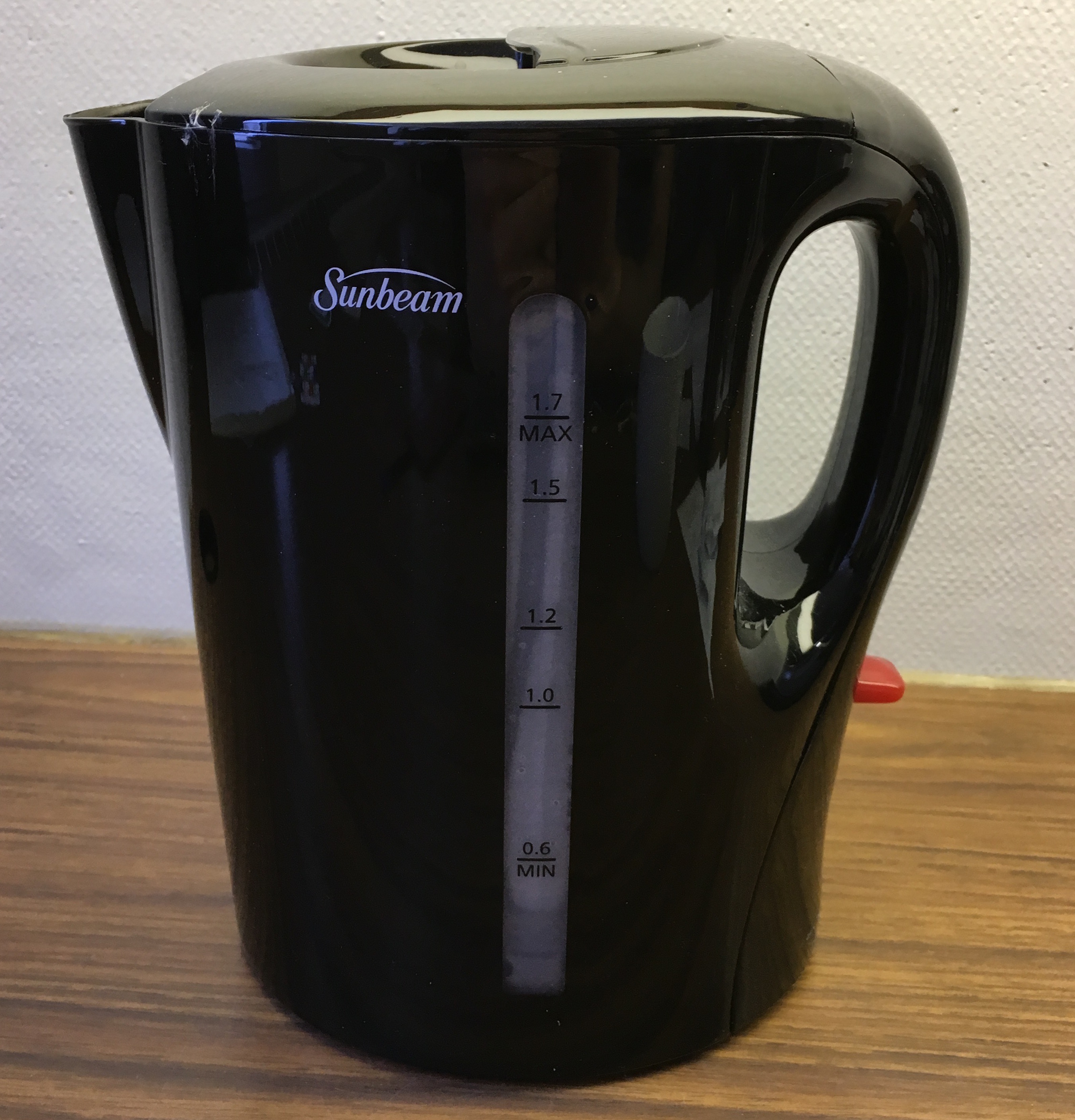
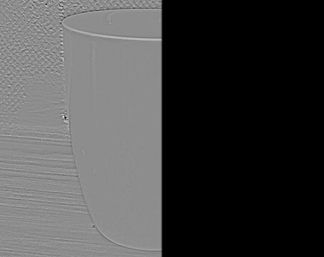
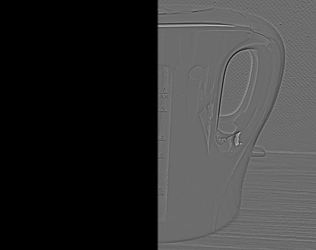
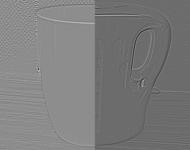
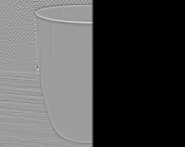
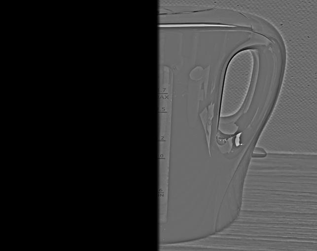
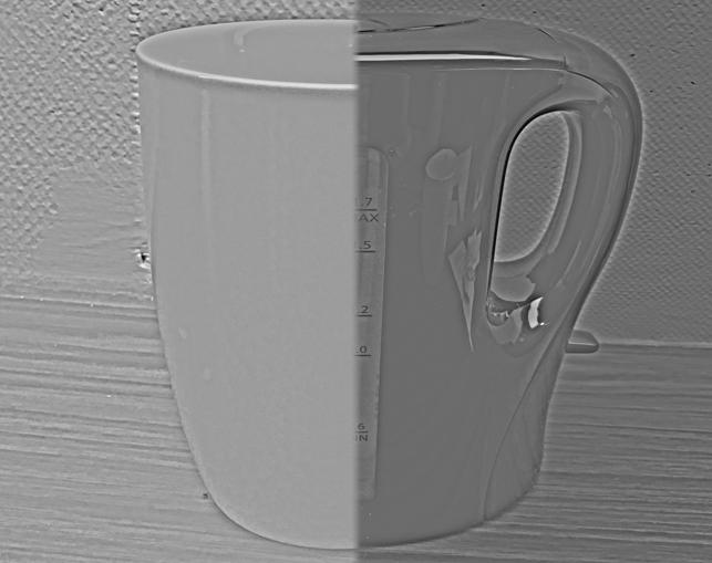
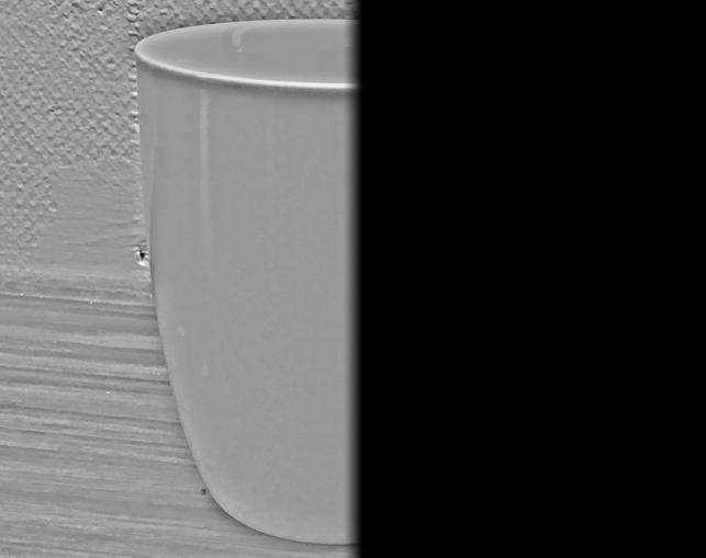
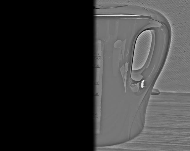
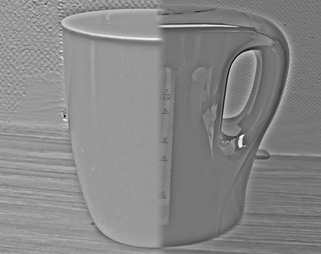
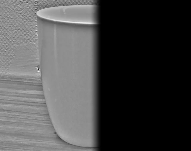
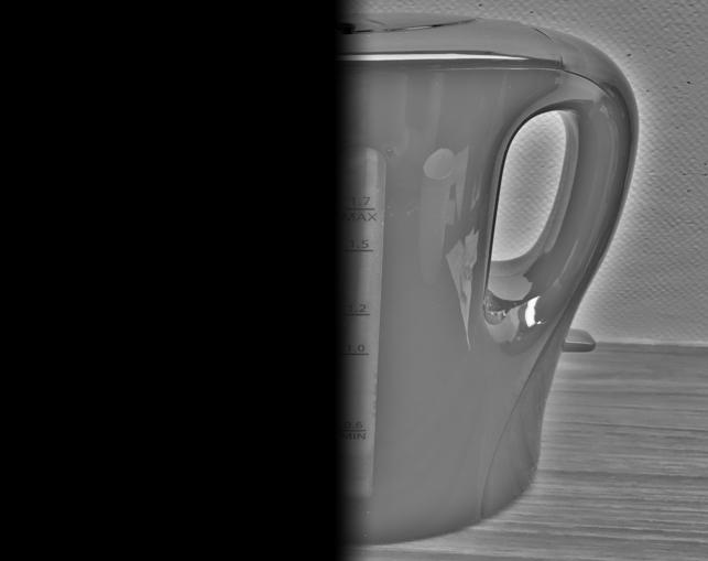
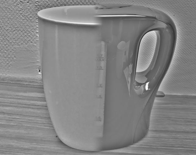
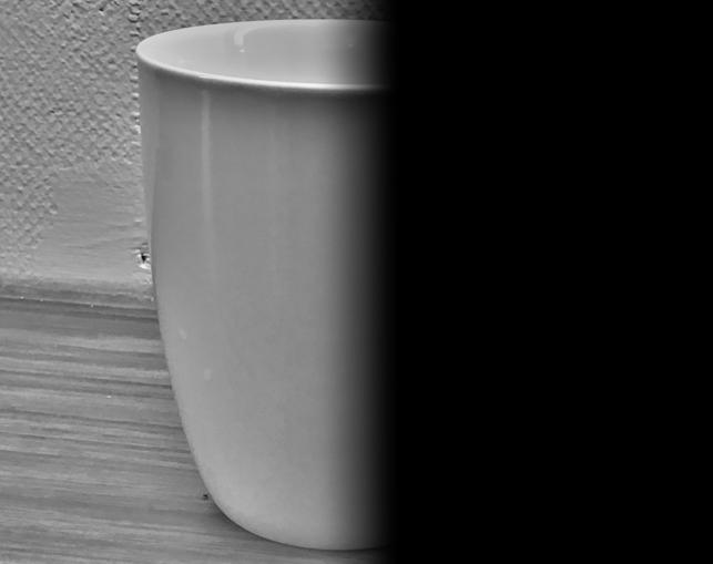
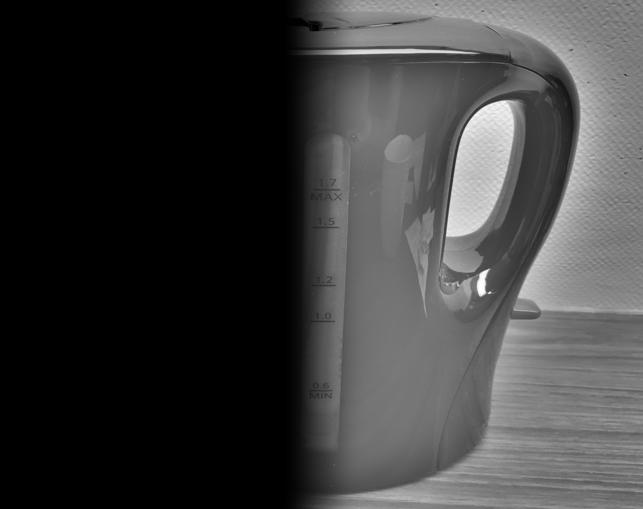
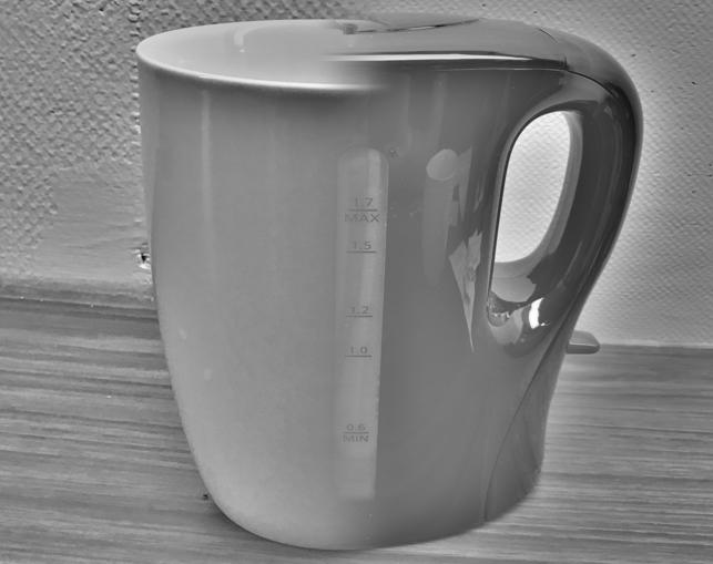
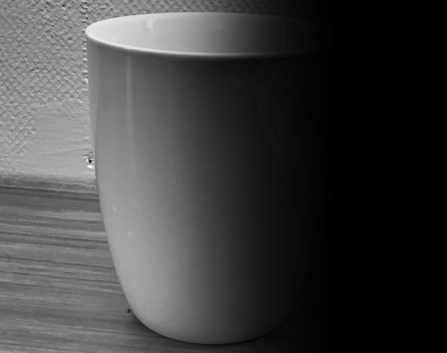
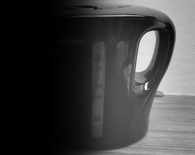
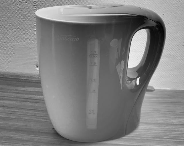
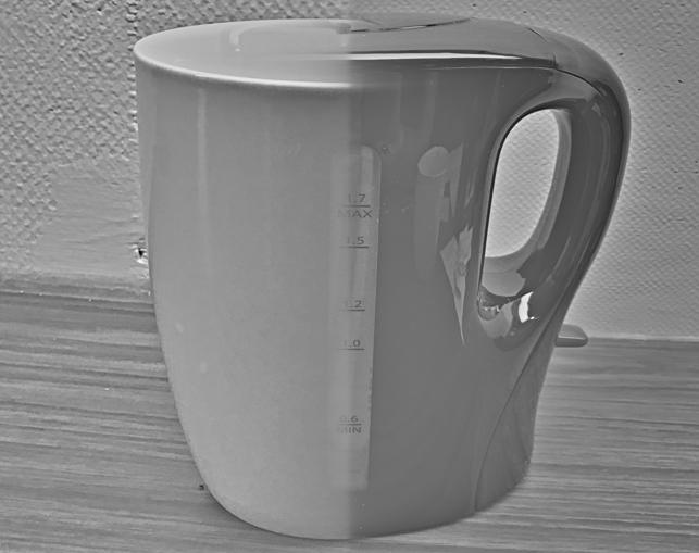
Kettle/cup
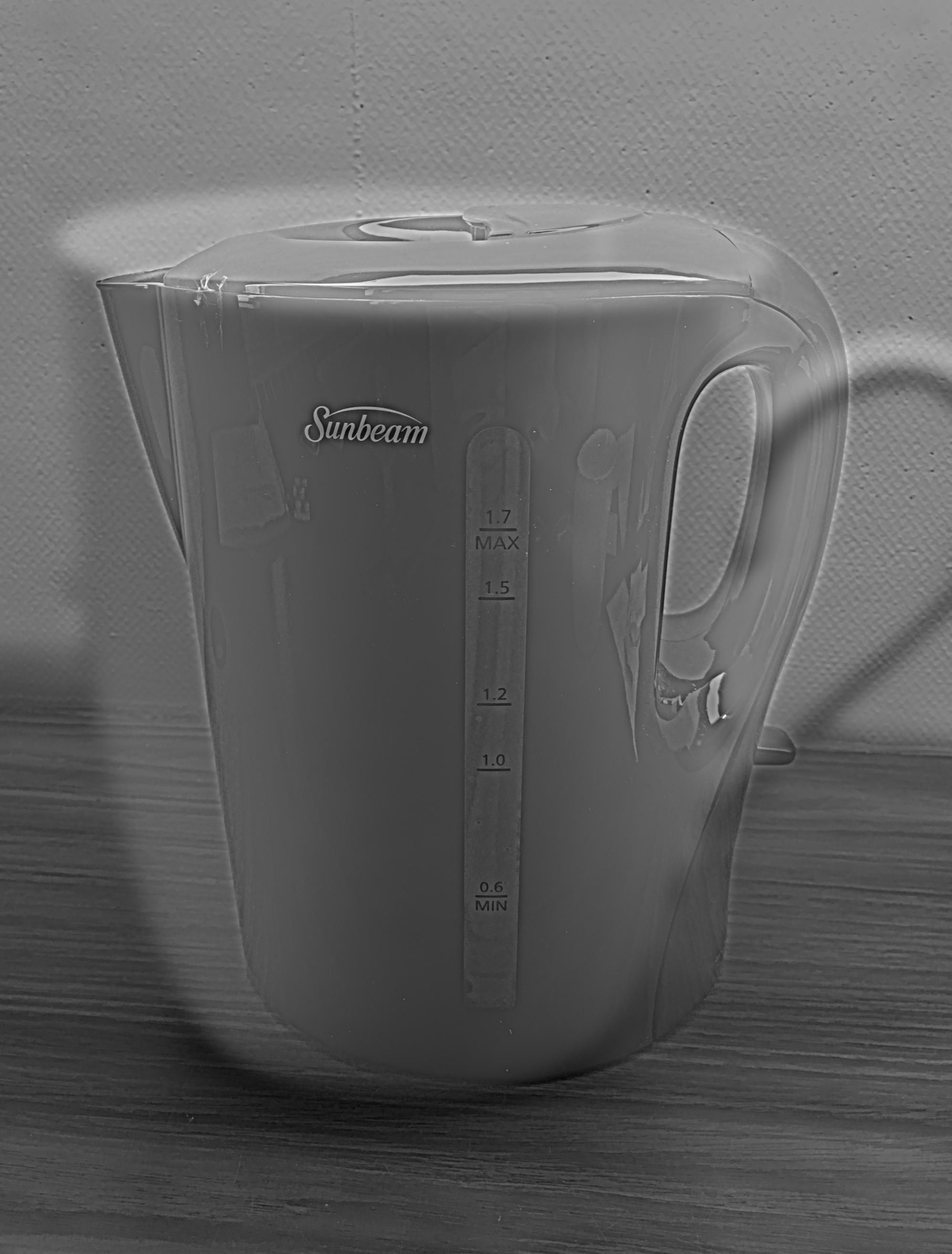
The cup and the kettle have some similar shapes, why this example works pretty well. Only, as the kettle is
mainly black and the cup white, I used the gray-scale images. The results are pleasing, the kettle is visible
from close and the cup from afar.
Here, cut-off frequencies were selected as: lowpass = 18, highpass = 8.
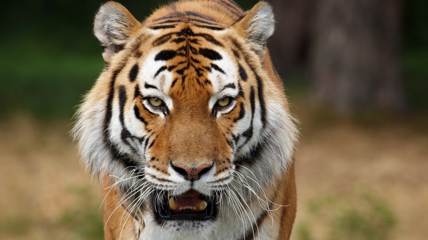
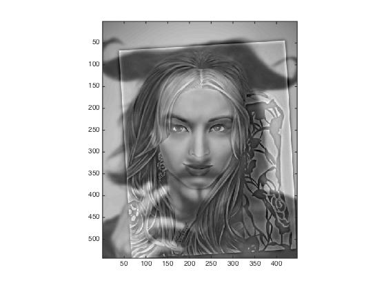
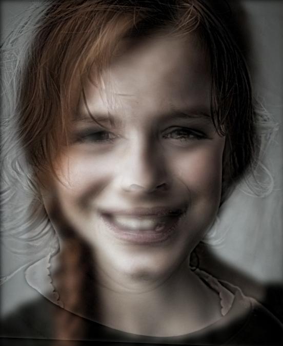
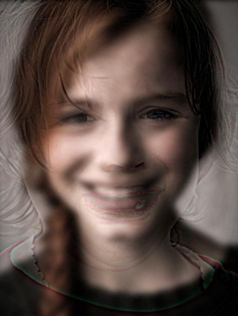
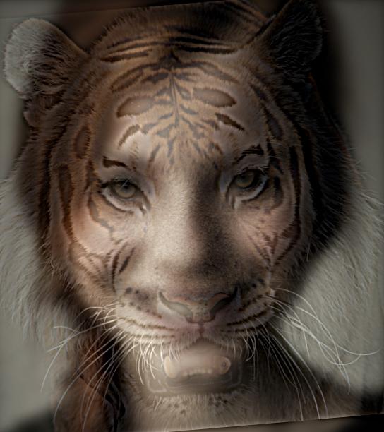
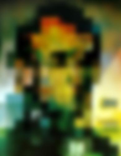
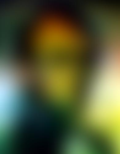
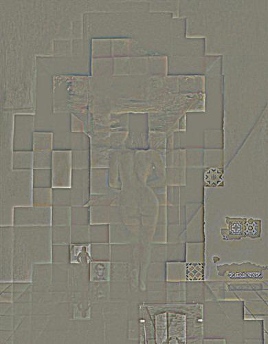
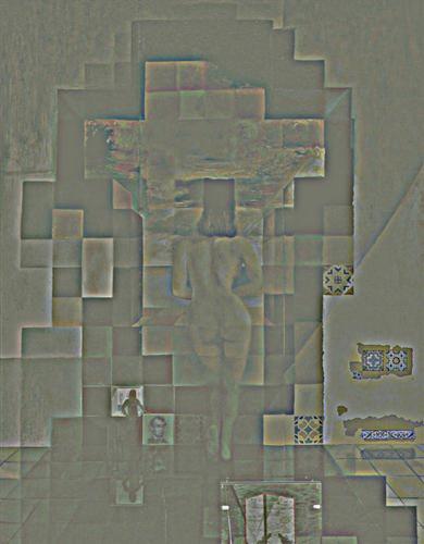
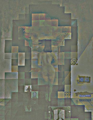
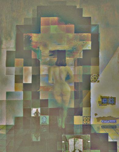
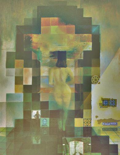
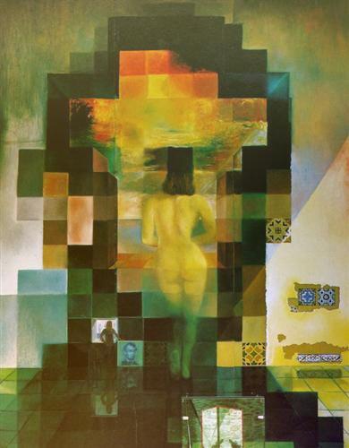
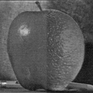
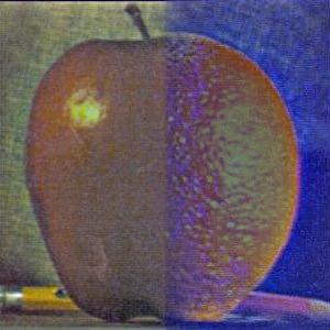
Smile/Tiger
Here, an image of a tiger is used for morphology with the smiling face from above:
source tiger: https://mynicetime23.files.wordpress.com/2014/09/tiger-face-16.jpg
The results here looks good:
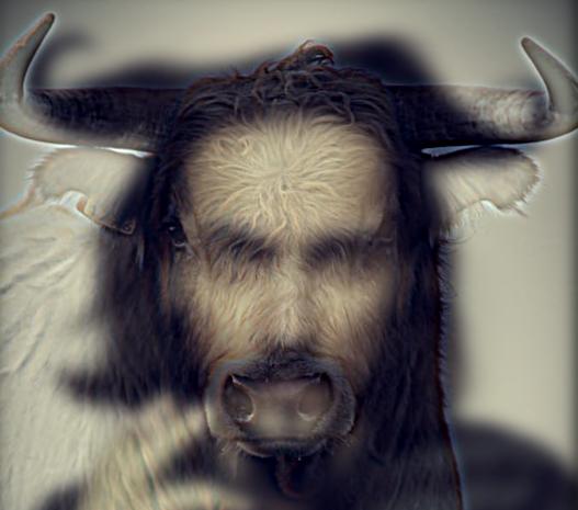
Devil/bull
Here, de the devil from above is combined with the head of a bull.
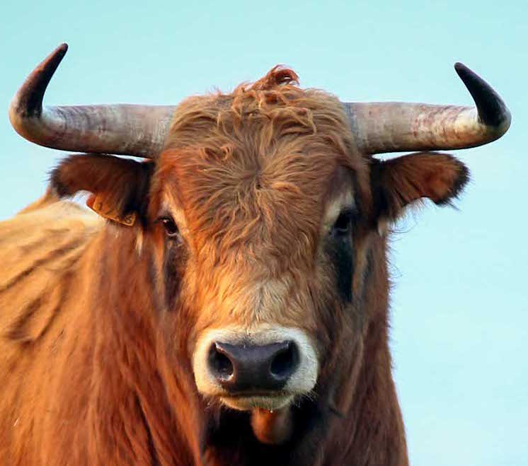
source bull: http://bullwatchcadiz.com/home-1/
Again, the effect can be seen.
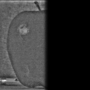
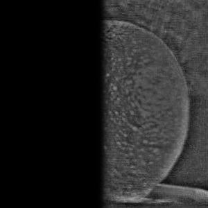
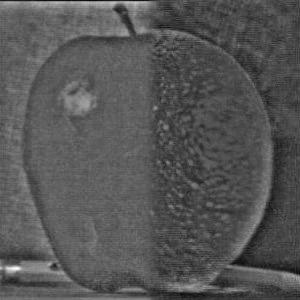
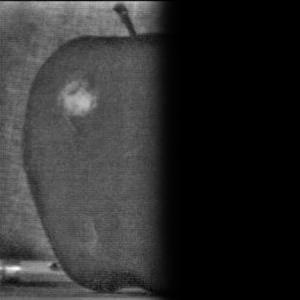
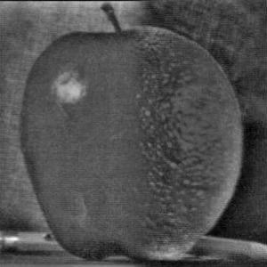
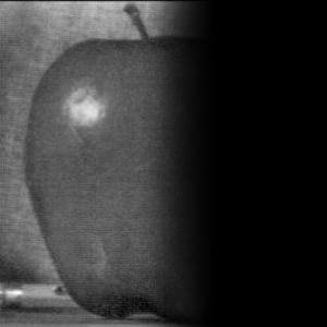
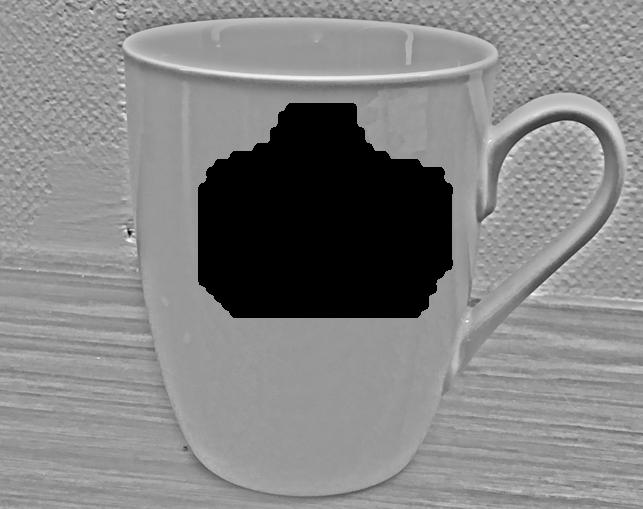
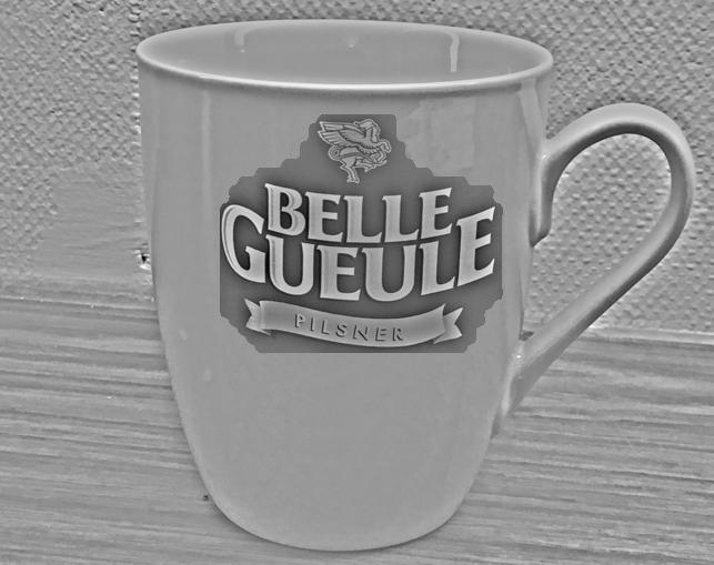
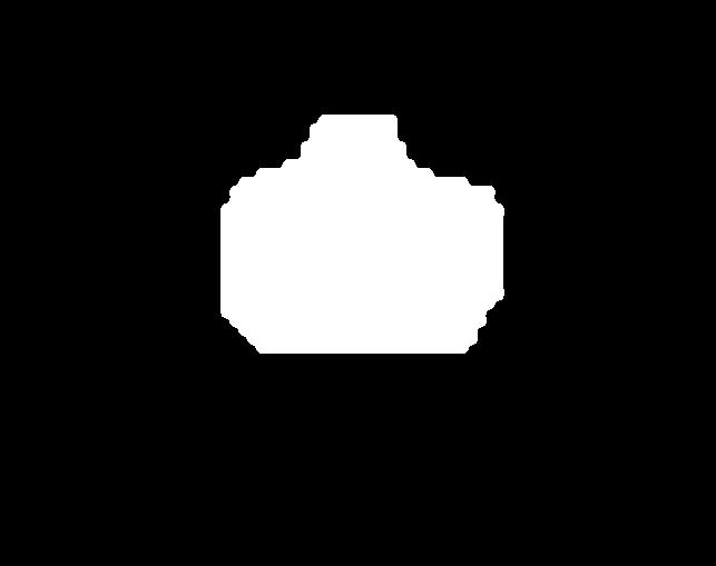
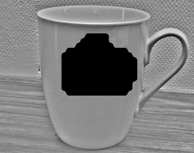
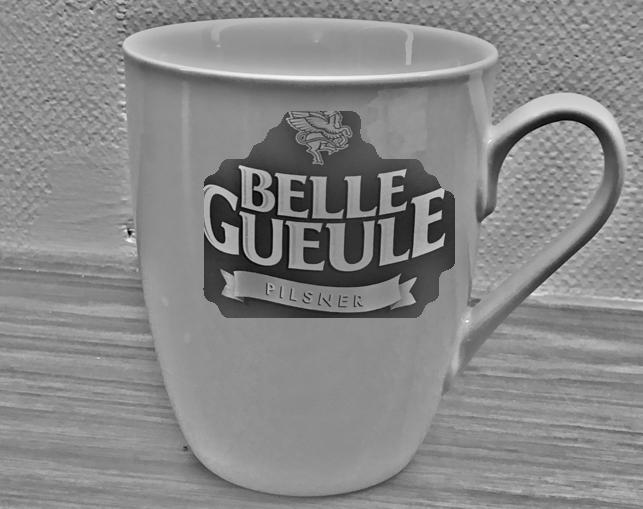
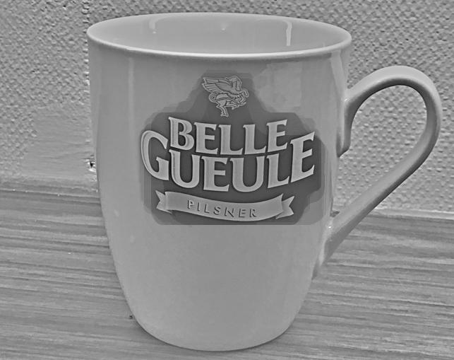
Beer bottle or cup?
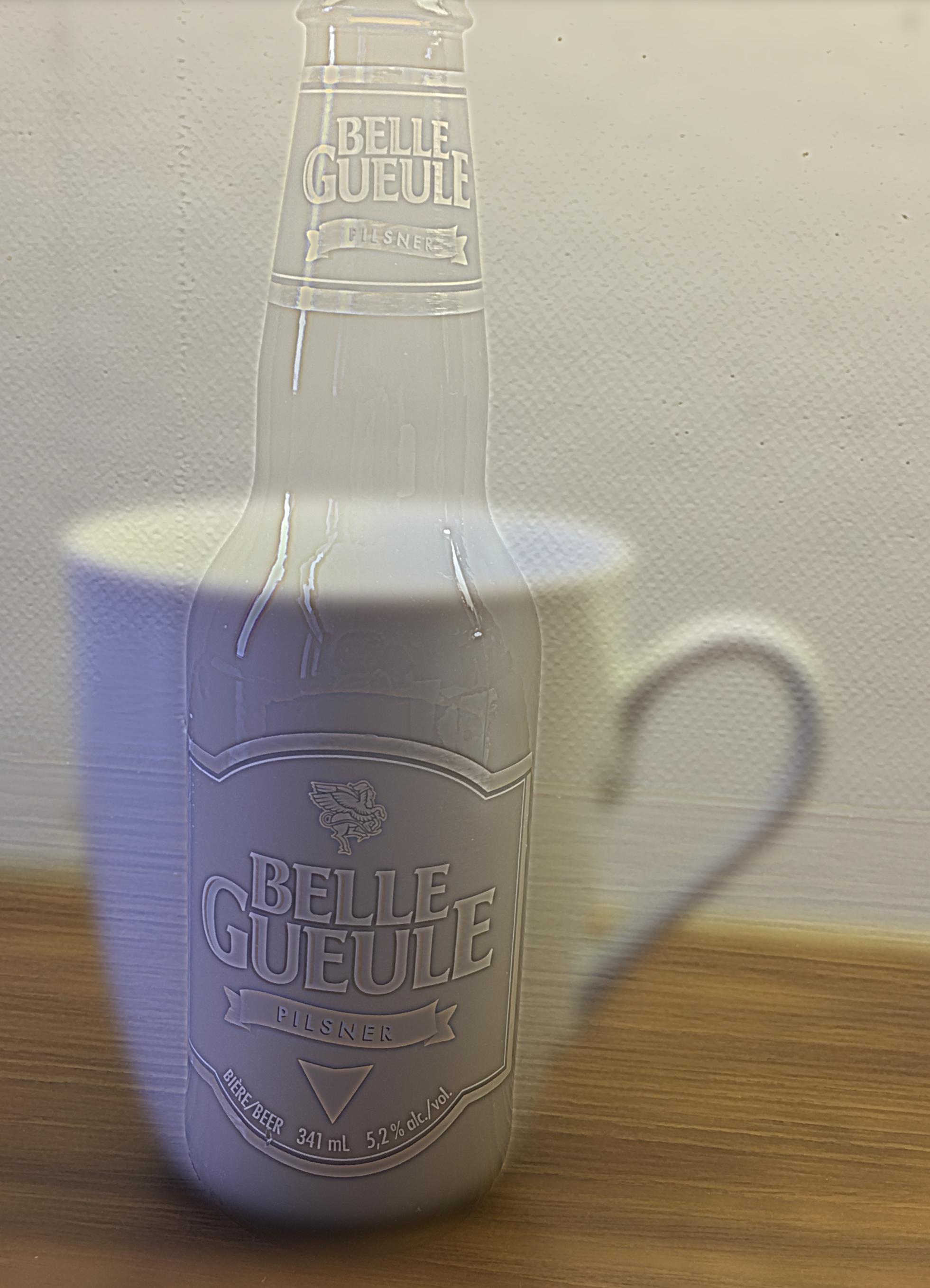
Here, I tried to combine a cup and a bottle. The combination has two problems: First, the label on the bottle
remains very distinct, even when a large amount of low frequencies are kept in the image. Second, the cup is white/bright, what
worsens the capability of hybrid image generation (see above). Here, cut-off frequencies were selected as: lowpass = 18, highpass = 6.
However, the beer bottle is clearly visible when close while the cup appears clearer when further away.
Dish detergent or shampoo?
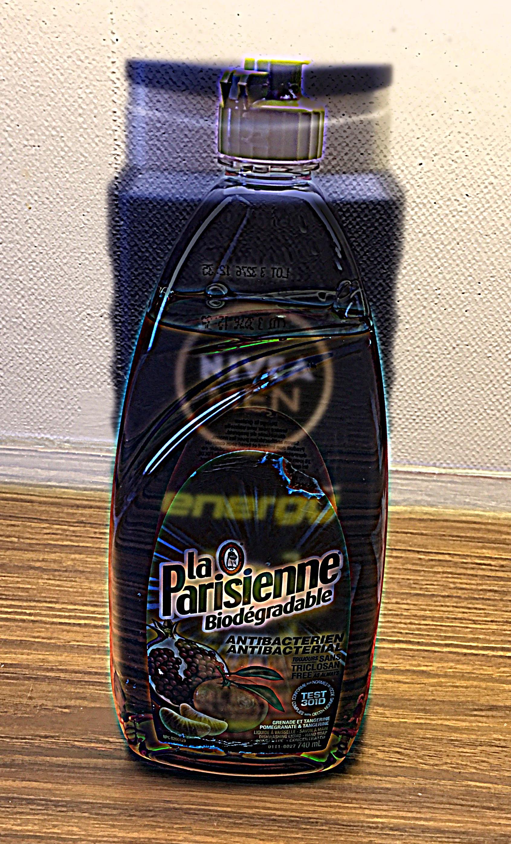
In this example, I used containers for shampoo (very dark) and dish detergent (very bright). The problem, thus, was, that the shampoo was mainly
visible for its brightness. So I adapted the hybrid stacking and brightened up the shampoo. However, the result is not as clear as for other images.
Here, cut-off frequencies were selected as: lowpass = 6, highpass = 8.
For N = 7 (i.e. the stack has 7 levels), the results look as follows (top row: Gaussian stacks, bottom row: Laplacian stacks):
| sigma = 2 | sigma = 4 | sigma = 8
| sigma = 16 | sigma = 32 | sigma = 64
| sigma = 128 | 
| 
| 
| 
| 
| 
| 
| 
| 
| 
| 
| 
| 
| 
|
| sigma = 2 | sigma = 4 | sigma = 8
| sigma = 16 | sigma = 32 | sigma = 64
| sigma = 128 | 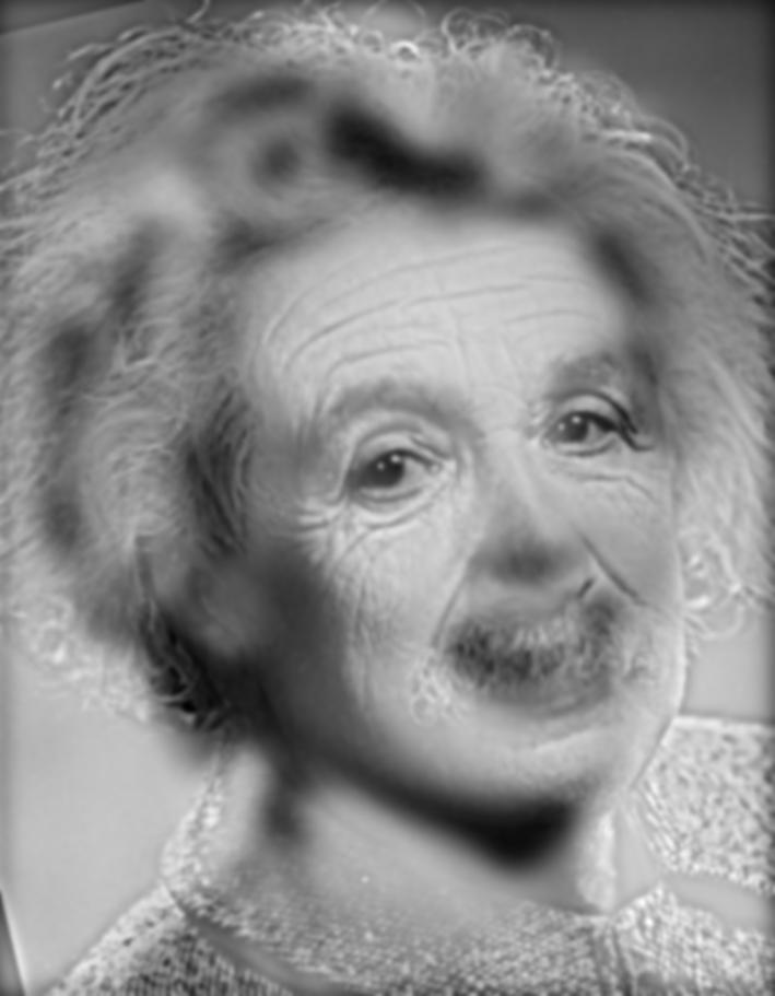
| 
| 
| 
| 
| 
| 
| 
| 
| 
| 
| 
| 
| 
| 
| 
| 
| 
| 
| 
| 
|
1a. slightly (!) smooth image which should be resized. This step is important to avoid aliasing caused by high frequencies.
1b. take every second pixel of image on preceding pyramid layer. As this sampling pattern was used, step 1a is necessary.
2. for visualization, bring smaller image on pyramid layer to original size again.
For the resizing in step 2, an own function was written where
every pixel value in the smaller image was assigned to [k x k] pixels in an empty matrix of size of the original image, where k represents the scale.
In order to validate my approach, I compared my results to the results from impyramid as implemented in Matlab.
The following images show the pyramid layers brought to the size of the original image:
| sigma = 2 | sigma = 4 | sigma = 8
| sigma = 16 | sigma = 32
| 
| 
| 
| 
| 
|
The original, smaller pyramid-stacks look as follows:
| sigma = 2 | sigma = 4 | sigma = 8
| sigma = 16 | sigma = 32
| 
| 
| 
| 
| 
|
impyramid from MATLAB results in the following pyramids:
| sigma = 2 | sigma = 4 | sigma = 8
| sigma = 16 | sigma = 32
| 
| 
| 
| 
| 
|
Although the significane of the Gaussian pyramid basically is the same as the Gaussian/Laplacian stack from above,
i.e. structures on different scales are revealed as different frequency bands are selected on every layer, the results illustrate
the aliasing effect. While for large scales (2, 4), the results from stacks and pyramids are similar, aliasing effect for smaller scales
(above level 2) becomes visible when the pyramid images brought to size of the original input image are considered.
This reveals a huge issue for the implementation of the pyramid approach. A very thorough resizing is required here
while for the stack-approach, resizing is not necessary as the adapted filter is always applied on the original image.
As consequence, comparison of the pyramid layers with the Gaussian stacks from above reveals the pyramid
approach to be rather inappropriate for revealing the frequency components on each scale level which we aim at
exposing. In the pyramid approach, the pixel values are not adapted in the same way as for the hybrid image
computation. High gradients (i.e. clearly visible pixel boarders) between neighboring pixels
can be recognized which are due to the sampling sceme where pixels are skipped.
Comparison with the Matlab implementation furthermore reveals my pyramid-approach to result in similar
images, although the Matlab-pyramids seem slightly smoother.
1. decompose image into frequency bands using Laplacian stack approach from above
2. create a mask for blending and smooth it with Gaussian filter
3. blend images based on Gaussian filtered mask
4. create output image
The detailes to the approach can be found in Burt & Adelson, 1983. They also state the formula for
blending as:
LSl(i, j) = GRl(i, j)LAl(i, j) + (1 - GRl(i, j))LBl(i, j)
where l denotes the frequency component (level of stack), GR is the Gaussian mask, LA is the
frequency component of image A, LB the frequency component of image B.
The first image components from A and B are the highest frequencies. To blend this, a hard
transition/break can be used. The lower the frequencies contained in the components get, the
smoother the transition zone has to be chosen.
Finally, to create the output image, the blended images from the different component levels (stack
levels) are summed up and normalized.
| 
|
The following images show the different image components which are blended as well as the mask,
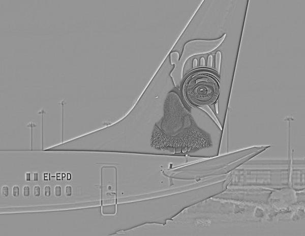
which was used for the blending. Furthermore, the blend image for each component is depicted.
| component of image A | component of image B | blended images | mask |
| 
| 
| 
| 
| 
| 
| 
| 
| 
| 
| 
| 
| 
| 
| 
| 
| 
| 
| 
|
|
|
|
| 
| 
| 
| 
|
The following images show the different components:
| component of image A | component of image B | blended images | mask |
| 
| 
| 
| 
| 
| 
| 
| 
| 
| 
| 
| 
| 
| 
| 
| 
| 
| 
| 
|
|
|
|
| 
| 
| 
| 
|
Comment: This examples reveals the importance of overlapping images, which should be blended. The objects in both images must fill the same area of the image and the shapes should be similar, if image halfs are combined. However, if not entire half sides should be blended, irregular masks an be used.
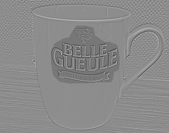
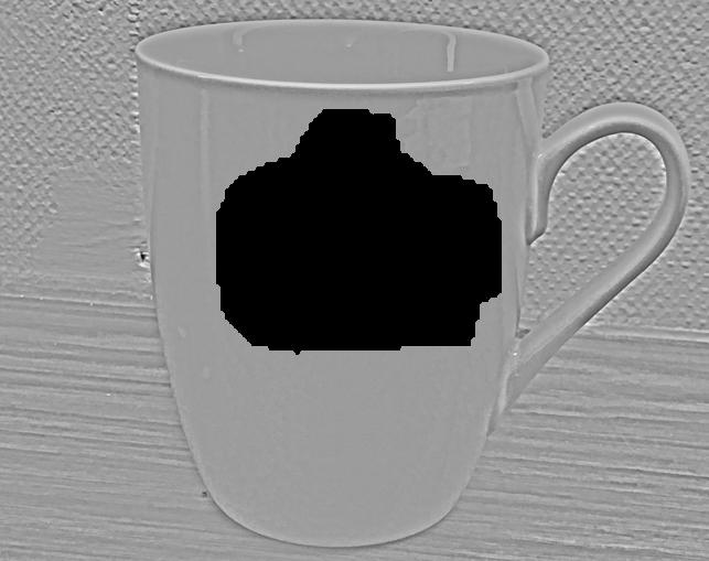
In a second example, an irregular mask is applied. The input images are the following:

The following images show the different components:
| component of image A | component of image B | blended images | mask |

| 
| 
| 
| 
| 
| 
| 
| 
| 
| 
| 
| 
| 
| 
| 
| 
| 
| 
| 
|
|
|
|
|
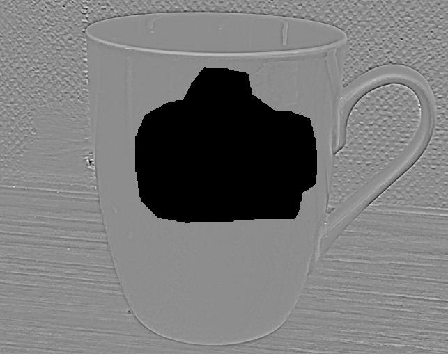
Comment: As the cup is white, artefacts in the transition zone are clearly visible. This is due
to the differing mask for each component, i.e. the mask is increasingly smoothed as frequency components
decrease. The artefacts then occur because the information taken from the cup-components is almost the same
on every layer (i.e. white) while the information from the label components changes on every stack layer.
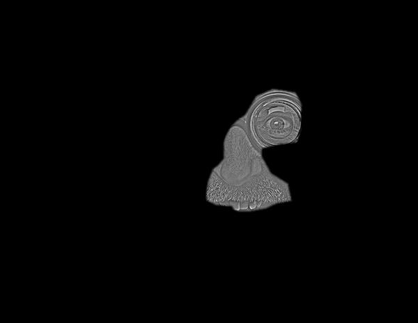
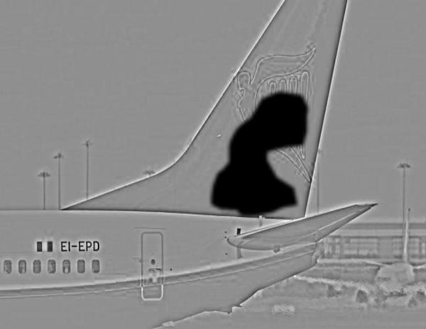
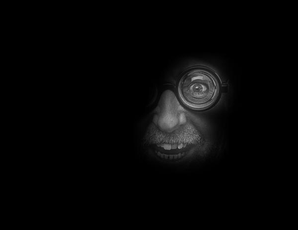
source: http://webneel.com/sites/default/files/images/project/best-portrait-photography-regina-pagles%20(10).jpg
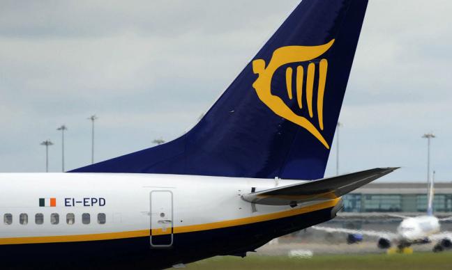
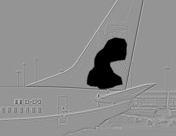
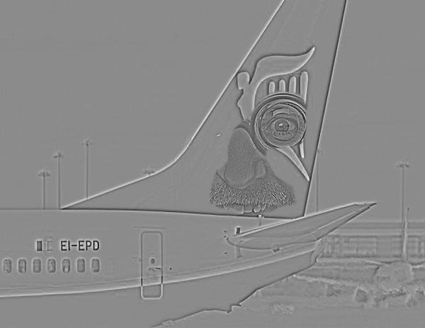
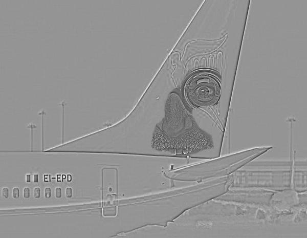
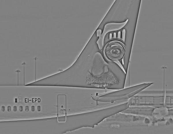
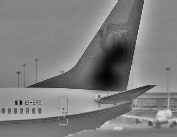
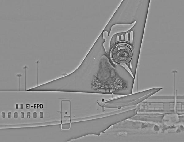
source: http://www.handelszeitung.ch/sites/handelszeitung.ch/files/imagecache/teaser-big/lead_image/ryanair-bestellung.jpg The following images show the different components:
| component of image A | component of image B | blended images | mask |
| 
| 
| 
| 
| 
| 
| 
| 
| 
| 
| 
| 
| 
| 
| 
| 
| 
| 
| 
|
|
|
|
|
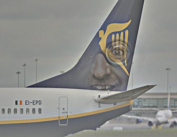
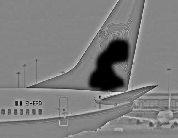
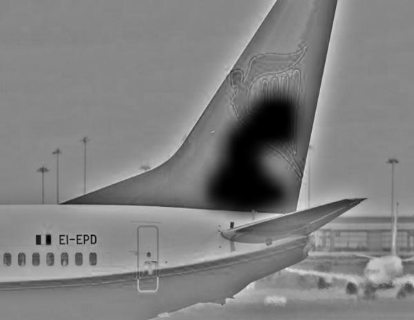
Comment: This example reveals the problem of an adequate filter size for smoothing the mask.
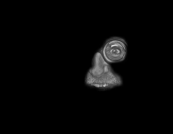
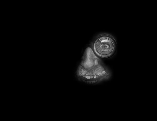
The idea was to put the eye and the nose of the man on to the tail of the plane, why the mask
was drawn around that very regions. However, as visible, the smoothed mask is slightly too large
for higher stack-layers, why additional parts of the man are selected and blended outside the tail of
the plane.
Thus, despite the implementation of the blending algorithm, also appropriate
image selection and alignment is of some importance.
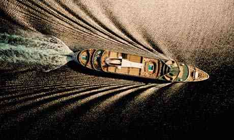
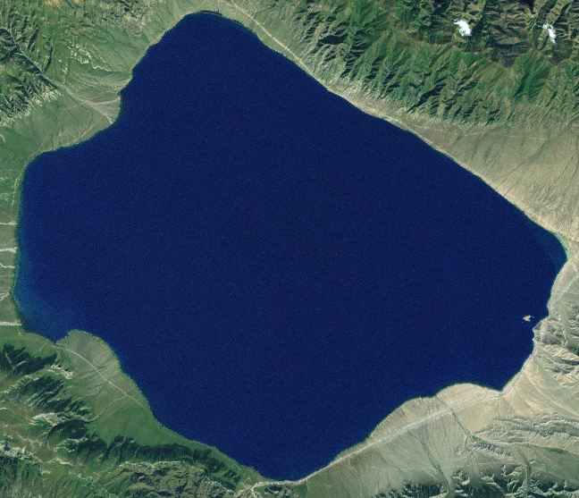
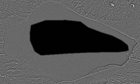
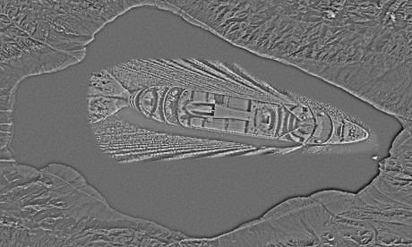
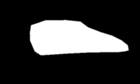
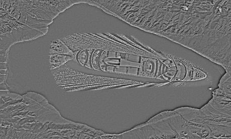
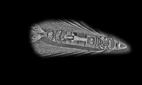
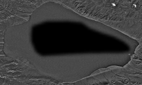
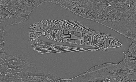
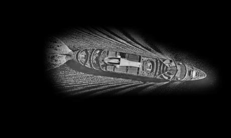
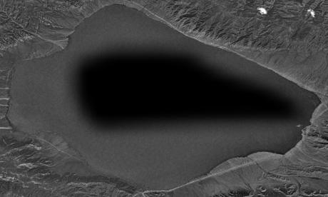
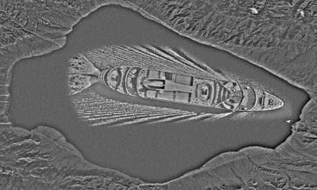
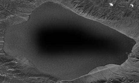
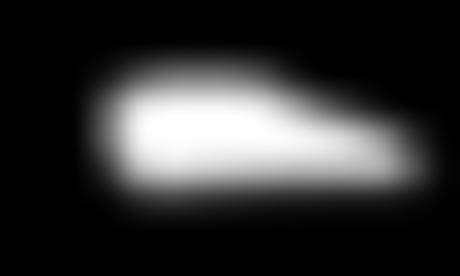
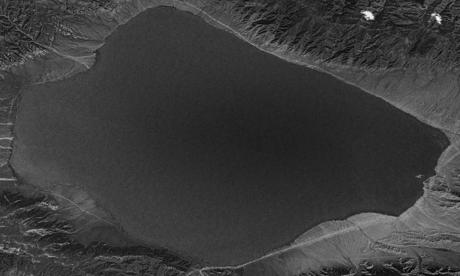
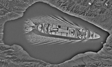
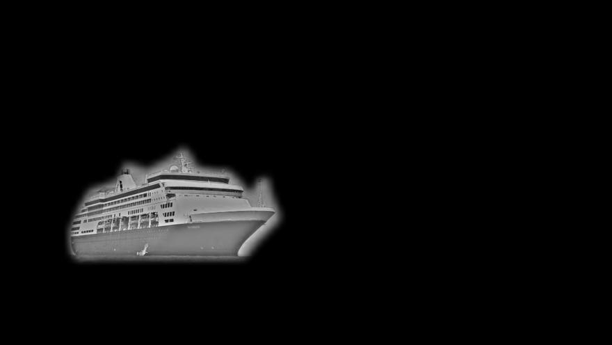
source (satellite image): https://upload.wikimedia.org/wikipedia/commons/7/7b/Satellite_Image_of_Lake_Sayram.png
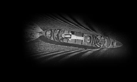
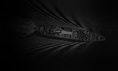
source (ship): http://guest-travel-writers.com/wp-content/uploads/2012/03/cruise-ship-above.jpg
The following images show the different components:
| component of image A | component of image B | blended images | mask |

| 
| 
| 
| 
| 
| 
| 
| 
| 
| 
| 
| 
| 
| 
| 
| 
| 
| 
| 
|
|
|
|
| 
| 
| 
| 
|
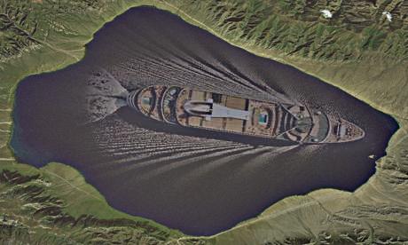
Comment: Blending works fine here as the ship could be placed within a clearly defined area in the centre. Furthermore, the blended ship is large and, thus, is distinctly visibile.
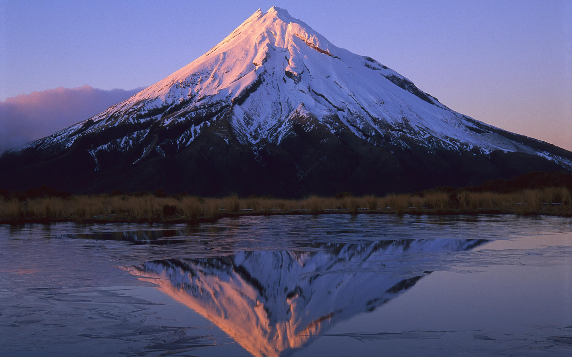
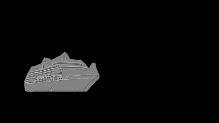
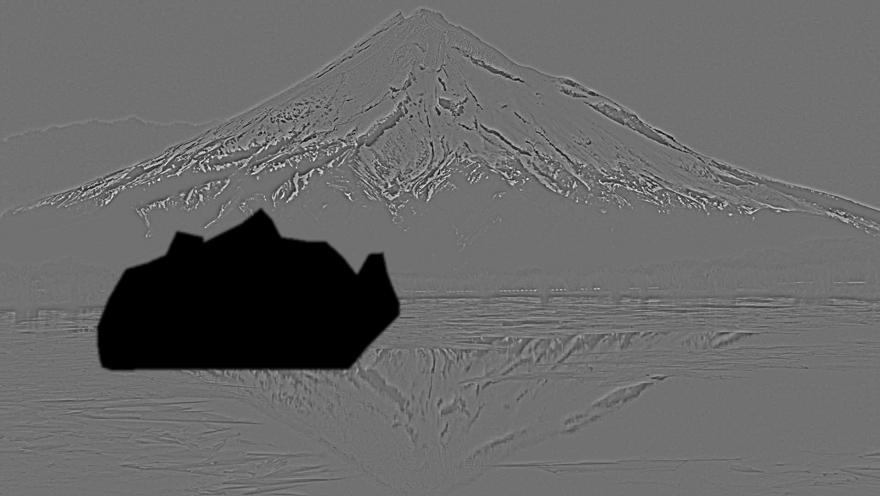
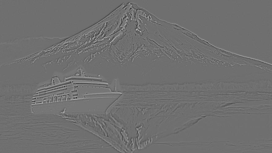
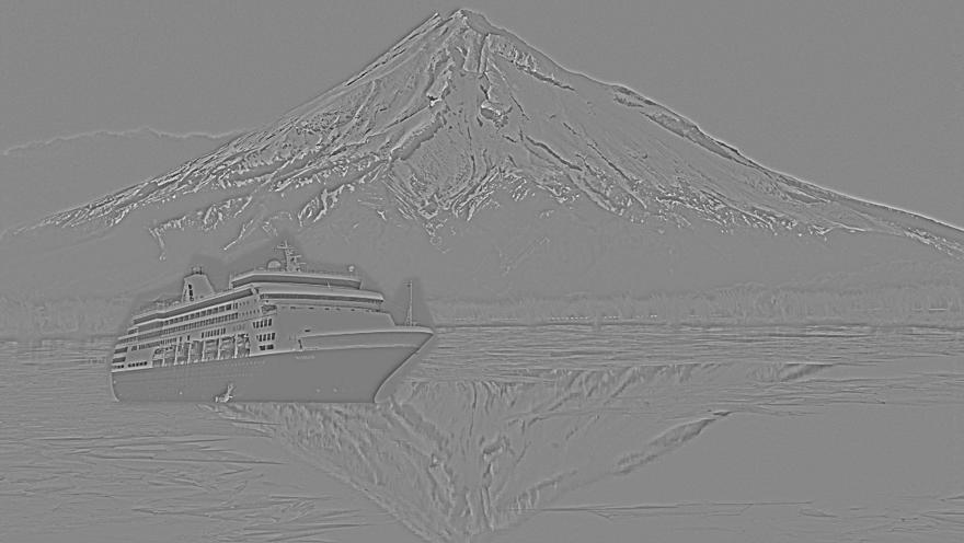
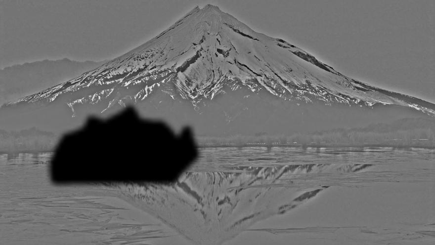
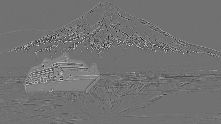
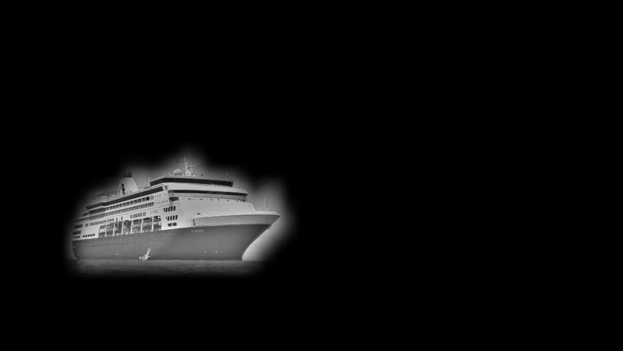
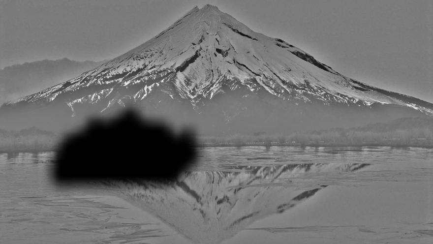
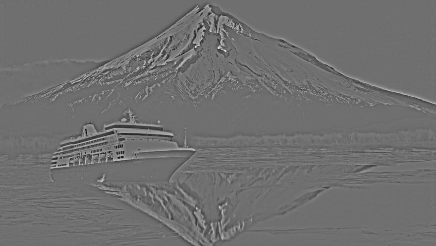
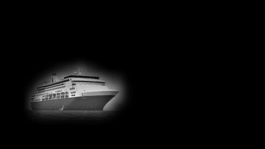
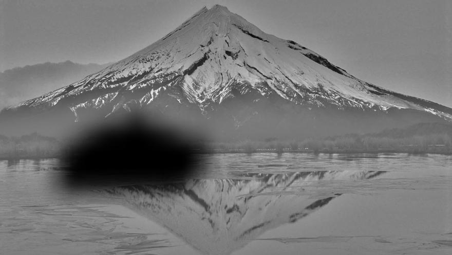
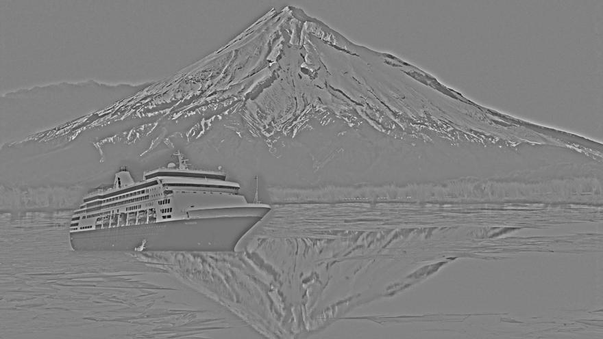
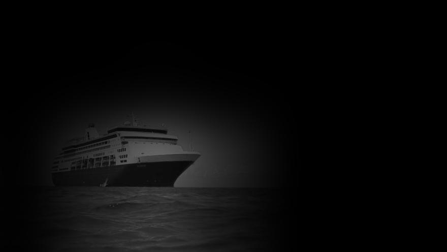
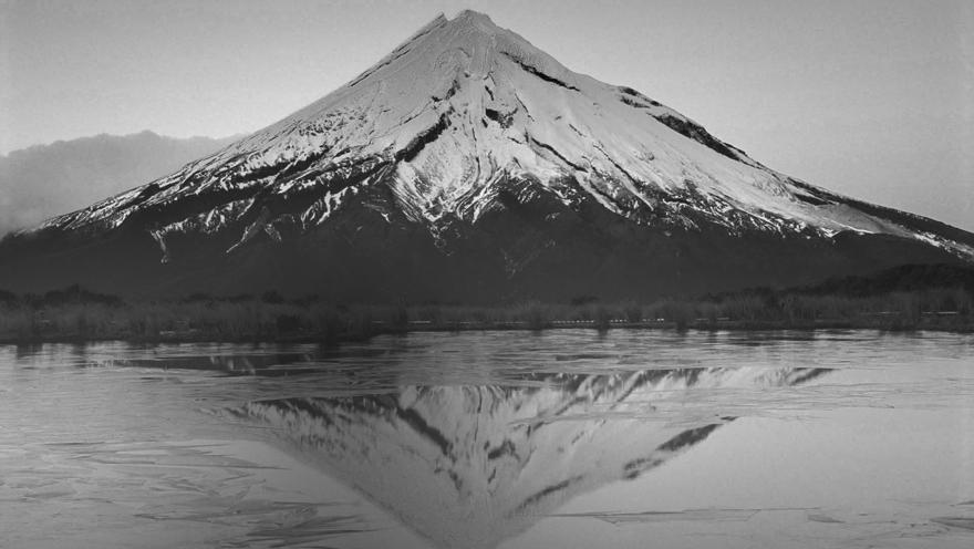
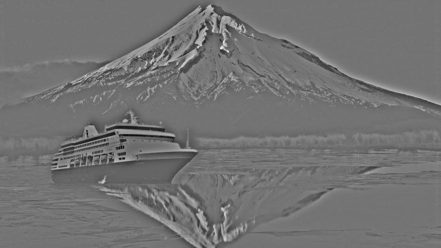
source (mountain): http://weknowyourdreams.com/image.php?pic=/images/mountain/mountain-07.jpg
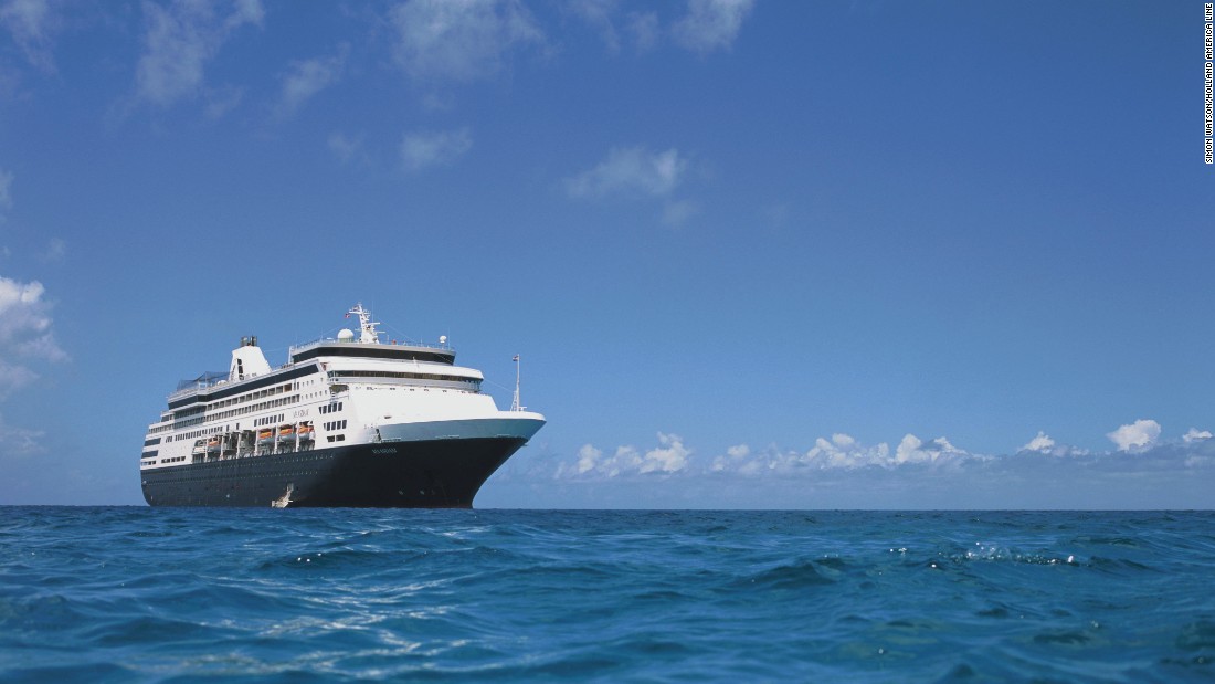
source (ship): http://i2.cdn.cnn.com/cnnnext/dam/assets/160205192901-02-best-cruise-ships-holland-america-maasdam-super-169.jpg
The following images show the different components:
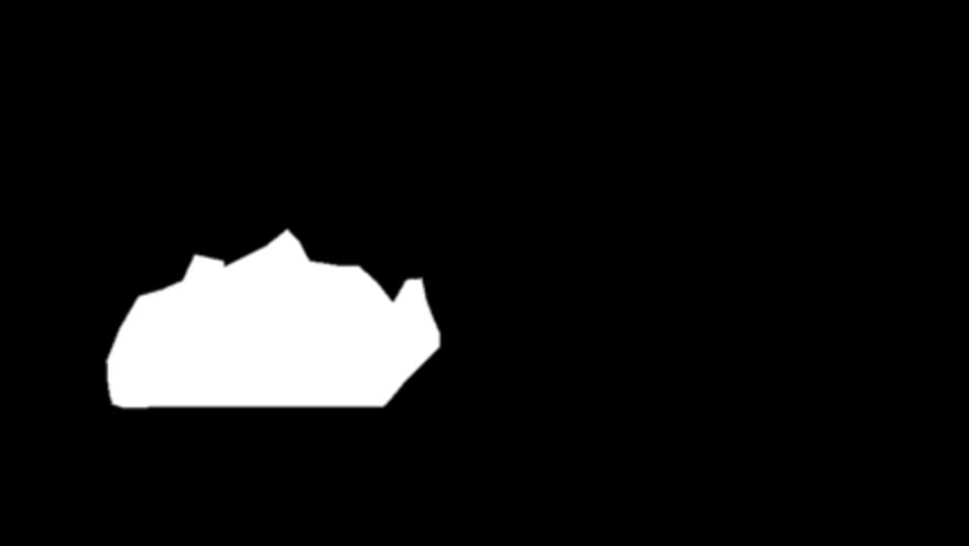
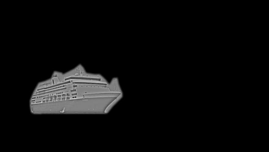
| component of image A | component of image B | blended images | mask |
| 
| 
| 
| 
| 
| 
| 
| 
| 
| 
| 
| 
| 
| 
| 
| 
| 
| 
| 
|
|
|
|
| 
| 
| 
| 
|
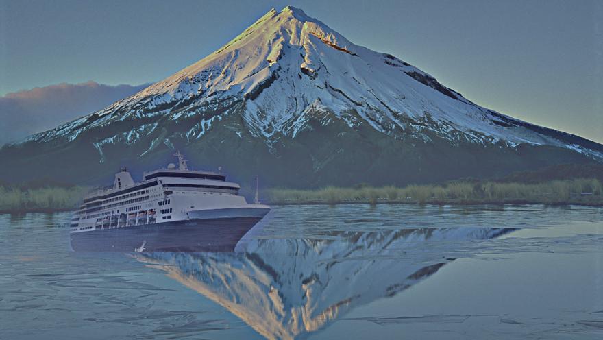
Comment: The clear blue sky which builds the background in the original ship image, almost
disappeared in the blend, thus, the blending works quite well. Of course, the mirrored ship
is still missing.